
Data storytelling is a powerful skill that allows you to translate complex data into compelling narratives that resonate with your audience.
It’s more than just presenting numbers and charts; it’s about weaving a story that informs, engages, and inspires action.
By mastering data storytelling, you can unlock the true potential of your data and make a significant impact in your field, whether you’re in business, science, or any other data-driven domain.
Finding the right data storytelling course on Udemy can feel like searching for a needle in a haystack.
With a plethora of options available, it’s easy to get lost in the sea of choices.
You’re looking for a course that not only teaches the fundamentals but also provides practical exercises and real-world examples to help you hone your skills and build a compelling portfolio.
Based on our in-depth analysis, we believe How to tell a story with data is the best overall course on Udemy for mastering data storytelling.
This comprehensive course covers everything from understanding your audience and structuring your narrative to choosing the right visuals and delivering impactful presentations.
It’s packed with practical exercises and real-world case studies, ensuring you gain a solid understanding of the principles and techniques involved in effective data storytelling.
However, we understand that everyone has different learning styles and preferences.
That’s why we’ve compiled a list of other excellent data storytelling courses on Udemy, catering to various skill levels and specific interests.
So, keep reading to discover the perfect course that will empower you to become a master data storyteller!
How to tell a story with data

This course teaches you how to transform data into captivating narratives.
You start with the basics of storytelling, learning how to structure your message using a classic “5-stage” approach.
You discover how to weave conflict and resolution into your data-driven narratives, making them more engaging and relatable.
The course also emphasizes the importance of understanding your audience, teaching you how to tailor your stories for maximum impact, whether your audience is composed of experts or beginners.
You then dive into the technical aspects of data visualization, learning how to create clear and compelling graphics.
The course covers various chart types, including pie charts, bar graphs, and line graphs, and you learn how to select colors effectively to highlight important information.
You also gain insights into using software tools like Python and JavaScript to create impactful data visualizations.
Finally, you explore the ethical considerations of using data in storytelling.
The course emphasizes the importance of presenting data honestly and responsibly, avoiding manipulation or falsification.
You finish the course equipped with the knowledge and skills to be an ethical data storyteller, capable of creating narratives that are both informative and trustworthy.
Storytelling with Data

In a world overflowing with data, the “Storytelling with Data” course empowers you to transform raw numbers into captivating narratives.
You learn to cut through the noise and present data in a clear, concise, and engaging way, making it easier for your audience to understand and remember.
This means learning to choose the right visuals for your data, whether it’s a bar chart for comparing sales figures or a line graph for showing trends over time.
You delve into decluttering your visuals, removing anything that distracts from the main message.
Imagine using color and size to highlight the most critical information, guiding your audience’s attention exactly where you want it.
This course doesn’t just stop at making pretty pictures – it teaches you how to weave your data points into a compelling story.
You learn how to structure your narrative to create impact, ensuring your audience walks away with a clear understanding of your message.
This course equips you with the ability to transform data from a jumble of numbers into a powerful tool for communication and persuasion.
Data Storytelling: The Best Complete Guide for Beginner

This course on data storytelling teaches you how to use data to tell compelling and easy-to-understand stories.
You start by learning the basics of data storytelling, like what it is and why it’s important.
You discover the difference between exploring data and explaining it, which helps you choose the right way to present your information.
The course then dives into how to structure a good story, showing you the steps to create a beginning, middle, and end that keeps your audience interested.
You learn about different ways to present data, from simple charts and graphs to interactive dashboards.
You also discover the Gestalt Principles of Visual Design.
These principles, like Similarity, Closure, and Connectedness, teach you how to make your visuals easy to understand.
For example, you learn how using similar colors for related data points can make them stand out.
You also explore Preattentive Attributes such as color, form, and motion to grab your audience’s attention and make your data pop.
This course goes beyond just teaching you theory.
You learn about different careers in data storytelling, the skills needed to succeed, and the tools professionals use every day.
You walk through the process of creating a data story, from gathering the data to presenting it in a way that is both informative and engaging.
Tableau for Data Visualisation and Story Telling
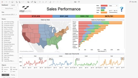
This Tableau course equips you with the skills to transform data into captivating stories.
You begin with the fundamentals of Tableau, exploring its various versions and mastering its workspace.
Using real-world datasets like “Superstore” and “World Indicator,” you uncover the power of data visualization.
You learn to build hierarchies for locations, analyze data using a wide array of charts — from basic bar charts and line charts to more complex Gantt charts and bubble charts — and work with different data types such as dates and geo maps.
You then delve deeper, mastering advanced visualization techniques.
You learn to construct histograms, bullet charts, highlight tables, treemaps, and boxplots.
This allows you to unlock new perspectives on data, identify trends, and extract meaningful insights.
Calculated fields and parameters become your tools for manipulating data, while dashboards help you present your findings with clarity and impact.
The course culminates in the art of data storytelling.
You discover how to craft compelling narratives using Tableau, building dashboards and worksheets that transform data into engaging presentations.
Understanding your audience and tailoring your message to their needs become second nature.
You emerge from this course equipped not only to analyze data but also to wield it as a tool for persuasion, using it to weave captivating stories that resonate and leave a lasting impression.
Data storytelling with Power BI
This course equips you with the power to transform raw data into captivating stories using Power BI.
You start with the essentials of Power BI, mastering ten crucial features for effective data analysis.
You then explore basic analysis techniques and learn to sidestep common pitfalls, building a strong foundation for your data storytelling journey.
The course then guides you through crafting insightful dashboards, focusing on Key Performance Indicators (KPIs).
You discover how to build basic KPI cards and leverage tools like OKviz for advanced customization.
You also become adept at calculating conversions, managing target versus actual values, and designing dashboards using a comprehensive checklist.
You then delve into the world of interactive tools, mastering techniques like dynamic diagram filtering, intuitive navigation menus, and engaging bookmarks.
You also learn to create compelling tooltips and switchers, enhancing your dashboard’s interactivity and user-friendliness.
You explore advanced visualization methods, using tools like waterfall charts, tornado charts, and bullet charts to present data in a visually impactful manner.
Finally, you unlock the art of data storytelling itself.
You learn to use the AIDA methodology, a powerful framework for crafting compelling data-driven narratives.
You practice creating impactful elevator pitches and even connect Google Sheets to Power BI for dynamic data integration.
This course empowers you to analyze data, create insightful dashboards, and communicate your findings with impact, making you a true data storyteller.
Ultimate Data Analytics and Visualization Bundle: 10 Courses
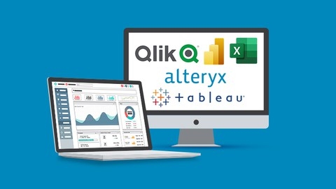
This Ultimate Data Analytics and Visualization Bundle guides you from beginner concepts to advanced visualization techniques using industry-standard tools.
You start with Excel’s Pivot Tables, learning to clean data and create reports.
You then transition to visualizations with Pivot Charts, where you master timelines, slicers, and calculated fields for deeper analysis.
Next, you dive into Power BI.
You learn importing, transforming, and modeling data with Power Query and DAX.
You build interactive dashboards to share insights effectively.
You then explore Tableau.
You connect to data sources, create diverse charts, and build interactive dashboards.
You master advanced features like parameters, sets, and table calculations.
The course covers best practices for creating various dashboards, including sales, marketing, and geospatial.
You also discover Alteryx, a data preparation and analytics tool that helps you automate tasks and handle large datasets.
You learn data blending, parsing, cleansing, and spatial analysis for creating maps and geospatial visualizations.
You even create analytic apps and macros for more powerful data analysis.
Finally, you learn about Qlik Sense.
You discover how to load data, create visualizations, and build interactive dashboards using Qlik Sense scripting.
This bundle covers both basic and advanced Qlik Sense concepts, including scripting, visualizations, and geoanalytics.
This comprehensive bundle gives you a solid foundation in data analytics and visualization.
You develop valuable skills in data cleaning, transformation, analysis, and visualization, learning to tell compelling stories with data using various tools.
Driving Results through Data Storytelling
This course teaches you how to transform data into engaging narratives that get results.
You learn why data literacy is so important and how to use data to create change.
The “Data, Story, Visuals (DSV)” diagram helps you unlock the stories hidden within your data.
You dive deep into storytelling techniques, learning about different types of data stories and how to tailor your message to your audience using the A.U.D.I.E.N.C.E. framework.
You master the S.T.O.R.Y. Line Framework, a powerful tool for building narratives with a clear message.
You discover the “Anablep,” a unique concept that helps you understand and connect with your audience.
You discover the power of visuals in storytelling and learn how to choose the right visuals for maximum impact.
You explore six distinct types of data stories, learning which visuals work best for each.
You learn how “pre-attentive attributes” can guide your audience’s attention, and you discover the importance of minimizing “chart junk” to make your visuals clear and compelling.
This course teaches you how to use data storytelling to drive action.
You learn how to apply design thinking principles to your visuals and discover how to transform even basic visuals into something extraordinary.
Data Storytelling for Data Professionals

This data storytelling course guides you through the fundamentals all the way to advanced techniques.
You begin by exploring the history of data storytelling and its importance in our world.
You then discover how to construct compelling narratives using data to support your message.
This journey equips you with the ability to transform data into a language everyone understands, bridging the gap between numbers and their impact.
You learn specific storytelling frameworks, including the 5 Step Data Storytelling Framework and the Storycircle Framework, which give your stories structure and help you clearly communicate your main points.
You also learn how to bring visual narratives to life with interactive elements.
Imagine making data relatable by incorporating analogies and metaphors, making even complex information easier to grasp.
This course empowers you to take raw data and mold it into an engaging and impactful story.
The course teaches you how to infuse your stories with emotional appeal and provide context, allowing your audience to connect with the data on a deeper level.
You will discover how to weave actionable insights into your narratives, prompting your audience to take specific actions based on the information presented.
Mastering these skills enables you to craft data-driven narratives that are not only informative but also persuasive and impactful.