Data visualization is a crucial skill in today’s data-driven world.
It involves transforming raw data into insightful and easily understandable visuals like charts, graphs, and dashboards.
This allows for better communication of data insights, identification of patterns and trends, and ultimately, more informed decision-making.
By mastering data visualization, you can effectively convey complex information, influence stakeholders, and drive positive change in various fields, from business and science to healthcare and education.
Finding the perfect data visualization course can be challenging, with numerous options available online, each promising to unlock the secrets of data storytelling.
You’re searching for a course that not only covers the technical aspects of creating visualizations but also delves into the art of crafting compelling narratives that resonate with your audience.
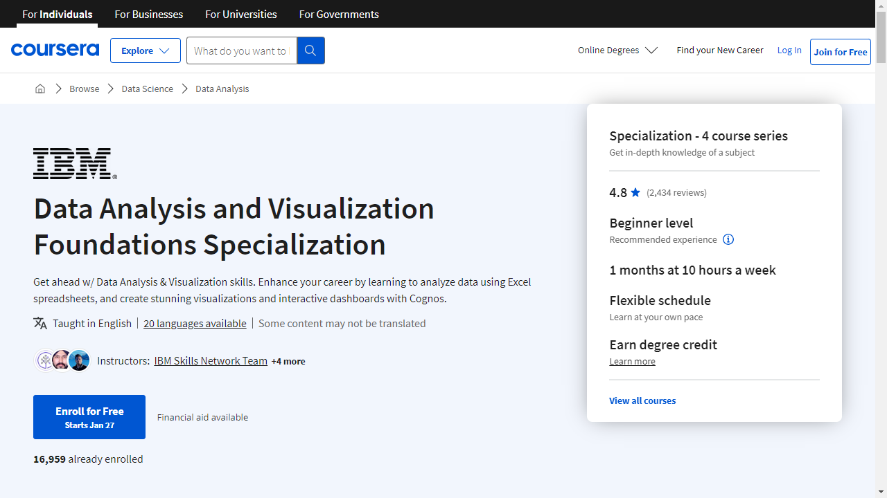
Based on our research, the best overall course for mastering data visualization is the Data Analysis and Visualization Foundations Specialization offered on Coursera.
This comprehensive specialization equips you with the fundamental skills needed for data analysis and visualization, covering everything from data ecosystems and Excel analysis to various visualization techniques and interactive dashboards.
Its blend of theory and practical application makes it an ideal choice for beginners and those looking to solidify their data visualization foundation.
However, the ideal course for you depends on your specific needs and learning preferences.
We’ve compiled a list of top-rated data visualization courses catering to various skill levels, software preferences, and learning goals.
So, keep reading to discover the perfect course to embark on your data visualization journey!
Data Analysis and Visualization Foundations Specialization

Provider: Coursera
This specialization equips you with the fundamental skills needed for data analysis and visualization.
You will start by understanding the data ecosystem, including roles like Data Analysts, Data Scientists, and Data Engineers, and exploring data structures like databases, data warehouses, and data lakes.
You will also learn about tools such as Hadoop, Hive, and Spark, used for managing large datasets.
The specialization guides you through using Microsoft Excel for data analysis, covering tasks from data entry and manipulation to cleaning, sorting, and filtering data.
You will become proficient in using functions, pivot tables, and other tools for effective data analysis.
Finally, you will master the art of data visualization.
You will learn to create impactful charts and graphs in Excel and Cognos Analytics, a business intelligence tool.
You will explore various visualization techniques, including line graphs, bar graphs, pie charts, treemaps, scatter charts, histograms, and filled map charts, and learn how to build interactive dashboards to communicate your data insights effectively.
The specialization culminates with a final assessment, testing your knowledge on data ecosystems, Excel skills, and data visualization techniques, preparing you for real-world data analysis tasks.
Data Storytelling and Data Visualization Mastery

Provider: Udemy
This data visualization course teaches you to transform raw data into captivating visual stories.
You start with the basics of data communication, learning what makes an effective visualization and understanding common pitfalls to avoid.
The course then delves into visual design principles, teaching you how visual perception influences design choices and how to select the right graph for your data.
You learn to go beyond basic graphs by using color, formatting, and narrative techniques to create impactful stories from your data.
The course explores concepts like the “Analytics Value Chain” and provides templates for crafting compelling narratives.
You’ll transform standard Excel graphs into powerful communication tools that drive action.
The course uses practical examples and case studies to solidify your learning.
You’ll see how to apply these techniques to real-world scenarios, turning confusing reports into clear, concise, and impactful data stories.
Data Literacy: Exploring and Visualizing Data Specialization
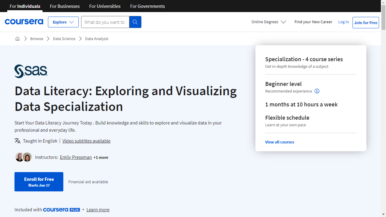
Provider: Coursera
This specialization begins with the fundamentals, guiding you through what data is, its significance in today’s world, and how to interpret it effectively.
You will explore real-world examples, like the COVID-19 pandemic, to understand how data drives informed decision-making.
This foundational course equips you with the essential skills to become data literate.
You will then transition into hands-on learning, exploring and visualizing data through practical techniques.
Following the journey of a small business owner, you will discover how they leverage data to enhance their company’s performance.
This practical approach teaches you data preparation, analysis, and the creation of impactful visualizations to communicate your insights effectively.
The specialization then introduces you to the robust capabilities of SAS Visual Analytics and the SAS Viya platform – powerful tools for data analysis.
You will learn to access, investigate, and prepare data for analysis, using both SAS Visual Analytics and SAS Data Studio.
Finally, you will dive into data modification for analysis, performing data discovery, and crafting interactive reports.
This last stage empowers you to harness the full potential of SAS Visual Analytics on the SAS Viya platform.
Microsoft Excel: Data Visualization, Excel Charts & Graphs
Provider: Udemy
This course equips you with the skills to transform raw data into insightful visuals using Microsoft Excel.
You begin by learning fundamental data visualization principles, including the “10-Second Rule” for assessing chart clarity.
You then explore a wide array of chart types, from basic bar and line charts to more specialized options like funnel, sunburst, and waterfall charts.
The course guides you on how to choose the most appropriate chart type to represent your data effectively.
You dive into customizing these charts to enhance their visual appeal and clarity.
You discover techniques to format charts with various colors, styles, and layouts.
You learn to add elements like trendlines to highlight data patterns and secondary axes to compare multiple data series.
This course doesn’t stop at static visuals; it empowers you to create interactive charts and dynamic dashboards.
You leverage Excel functions like SUMIFS, OFFSET, and COUNTA to build dynamic charts that respond to user input.
You explore techniques like data validation to create interactive charts with drop-down menus, allowing users to filter data and explore different perspectives.
You discover the power of dashboards, combining various charts and interactive elements to provide comprehensive data overviews.
You will even learn to build custom charts like gauge charts and pacing charts to represent your data in unique ways.
You will also explore advanced chart types like tree maps, heat maps, and contour charts, as well as discover the geo-spatial mapping capabilities of Excel’s Power Map tool.
Data Visualization & Dashboarding with R Specialization
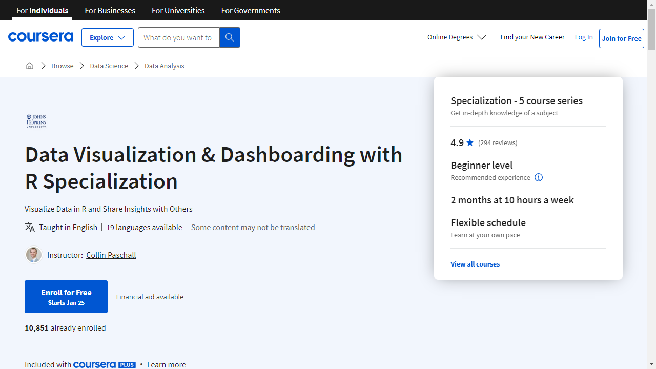
Provider: Coursera
This specialization from Johns Hopkins University takes you on a journey to learn how to use R, a powerful tool used by many professionals, to create captivating data stories.
You’ll start with the basics of R, learning how to import data, clean it, and transform it into a format ready for visualization.
Then, you’ll discover how to make basic reports using R Markdown, a tool that lets you combine code, text, and visuals.
Once you’re comfortable with the fundamentals, you’ll move on to explore ggplot2, a powerful package in R that allows you to create stunning visuals.
You’ll master different types of visualizations, including scatter plots, bar charts, histograms, and more.
As you progress, you’ll dive into advanced techniques with ggplot2, learning how to create sophisticated visualizations like spatial maps, interactive plots, and even animations, bringing your data to life.
You’ll then discover how to use Shiny and flexdashboard, two powerful tools that help you create interactive visualizations and dashboards.
With Shiny, you can build dynamic web applications, and with flexdashboard, you can combine different visualizations into a user-friendly format.
Finally, you’ll apply your learned skills to a real-world data project, using publicly available datasets to craft your own data story.
Learning Python for Data Analysis and Visualization Ver 1

Provider: Udemy
This course guides you through the world of data analysis and visualization using Python.
You begin by setting up Python on your computer and getting familiar with important libraries like NumPy, Pandas, and Seaborn.
You quickly learn how to create and manipulate arrays using NumPy, a powerful tool for handling numbers in Python.
With Pandas, you acquire skills to manage and analyze datasets, including importing and exporting data from various sources like text files, JSON, HTML, and even Microsoft Excel spreadsheets.
You then dive into the practical side of data manipulation.
You discover techniques like merging different datasets, combining them, and changing their structure to gain better insights.
You learn how to handle missing data points, identify outliers, and group data for more complex analysis.
This is where Seaborn comes in, a library that helps you create visually appealing and informative graphs from your data.
You learn to create histograms, density plots, box plots, and heatmaps, transforming your data into easy-to-understand visuals.
This course takes you beyond the basics and introduces machine learning with SciKit Learn.
You explore powerful algorithms such as linear regression, logistic regression, and support vector machines.
Through these algorithms, you learn to make predictions from data, such as forecasting stock market trends or analyzing election data.
The course wraps up by introducing additional tools and concepts, including statistical analysis with SciPy, interacting with databases using SQL, and even web scraping techniques to gather data from the internet.
Excel Skills for Data Analytics and Visualization Specialization
Provider: Coursera
This specialization is a perfect choice if you are looking to enhance your data visualization skills using Microsoft Excel.
You will begin by mastering the fundamentals of Excel for data analysis, including cleaning data, using Named Ranges and Tables, and applying logical and lookup functions.
This strong foundation prepares you for the more advanced techniques in the later courses.
The second course dives into the world of data visualization in Excel, teaching you how to create dynamic visualizations.
You will learn to create compelling stories with your data using various charting techniques like waterfall, sunburst, and map charts.
You will also explore conditional formatting, sparklines, and macros to design specialized and custom charts to bring your data to life.
Furthermore, you will learn how to summarize and filter data using pivot tables and charts to answer specific questions.
Finally, you will create interactive dashboards using slicers and macros for automation and interactivity.
In the final course, you will explore powerful tools for handling large datasets: Power Query, Power Pivot, and Power BI.
You will learn how to use Power Query to automate importing and preparing data and Power Pivot to perform advanced analytics.
Lastly, you will be introduced to the Power BI platform, which allows you to create stunning interactive reports and dashboards.
The Complete Tableau Bootcamp for Data Visualization
Provider: Udemy
This Tableau Bootcamp starts by explaining why data visualization is important and how Tableau can help you create powerful visuals.
You begin by learning the basics: installing Tableau and getting familiar with the software.
You quickly dive into data types and how to use them effectively in Tableau.
The course then explores preattentive visual properties – the visual cues that draw your eye.
You learn to leverage color, shape, size, and length to make your visualizations more effective.
With Tableau’s tools, you’ll transform these properties to create charts that accurately represent your data.
Next, you’ll dive into mapping in Tableau, learning to create insightful maps that reveal geographical patterns in your data.
You’ll work with spatial files and geographical roles to design interactive maps that tell a story.
The course also covers advanced calculations in Tableau, including table calculations and Level of Detail (LOD) expressions, allowing you to uncover deeper insights through complex aggregations and comparisons.
Finally, you’ll learn to build dashboards and stories in Tableau.
These tools will help you share your findings in a compelling and easy-to-understand way.
Through hands-on exercises and real-world projects, you’ll build your data visualization skills using Tableau.
Also check our posts on: