
Data visualization is a crucial skill in today’s data-driven world.
It involves transforming raw data into insightful and engaging visuals, like charts and graphs, that reveal patterns, trends, and outliers.
By mastering data visualization, you can communicate complex information effectively, make data-driven decisions, and create compelling stories with data.
Whether you’re a business analyst, a scientist, or simply someone who wants to understand data better, learning data visualization can significantly enhance your abilities.
Finding a good data visualization course can be overwhelming, especially with the abundance of options available online.
You want a course that covers essential concepts, teaches you practical tools, and provides hands-on experience to build a strong foundation.
You might be searching for a course that focuses on specific software or caters to your level of expertise, whether you’re a beginner or an experienced data professional.
Based on our research and reviews, we believe Microsoft Excel: Data Visualization, Excel Charts & Graphs is the best overall data visualization course on Udemy.
This course offers a comprehensive exploration of Excel’s charting capabilities, from basic charts to advanced techniques like creating interactive dashboards and custom visualizations.
It’s packed with practical examples and exercises, making it ideal for learners of all levels who want to master data visualization in Excel.
However, if you’re looking for courses that cover other tools or focus on specific aspects of data visualization, we have you covered.
Our list includes courses on popular programming languages like Python and JavaScript libraries like D3.js, as well as courses tailored to specific data visualization tools like Tableau and Kibana.
Keep reading to discover the perfect course to match your needs and learning preferences.
Microsoft Excel: Data Visualization, Excel Charts & Graphs
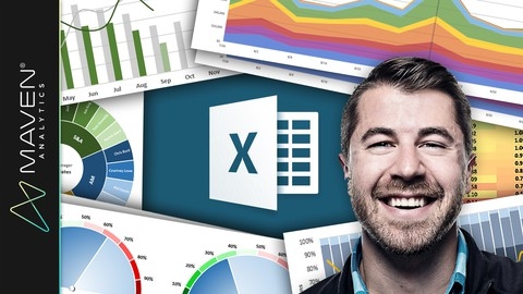
You’ll start by learning the fundamental principles of effective data viz, like minimizing noise and striking the right balance between design and function.
From there, you’ll dive into mastering the 20+ chart types in Excel through interactive demos and hands-on exercises.
Whether it’s bar charts, histograms, line graphs with trendlines, area charts, pies, scatter plots, or more advanced visuals like waterfall, funnel, radar, and 3D contour charts - this course covers it all using Excel 2016 and Office 365.
But it doesn’t stop at just the basics.
You’ll also learn next-level techniques to create truly powerful and interactive visualizations.
Things like building custom image overlay charts, highlighting date ranges using binary values, automating charts with named ranges and OFFSET/COUNTA functions, and adding scroll/zoom capabilities with form controls.
The demos really kick it up a notch, walking you through dynamic dashboards, charts that format based on values, visualizing percentages using array functions, and even designing custom gauge charts by combining trigonometry with scatter plots.
You’ll gain skills to transform plain data into engaging, best-in-class visuals.
Learning Python for Data Analysis and Visualization Ver 1
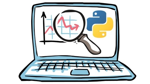
The course starts by ensuring you have Python and necessary modules set up on your computer.
You’ll then dive into learning NumPy for array creation and manipulation, a fundamental skill for data analysis.
The course guides you through creating arrays, performing operations on them, indexing, transposing, and processing arrays.
Next, you’ll learn about the powerful pandas library, which is essential for data analysis in Python.
You’ll work with pandas data structures like Series and DataFrames, indexing them, handling missing data, and performing summary statistics.
The course also covers reading and writing data in various formats like text files, JSON, HTML, and Excel.
Data transformation and manipulation techniques are covered in-depth, including merging, concatenating, reshaping, pivoting, handling duplicates, mapping, replacing, and binning data.
You’ll learn advanced techniques like grouping, aggregation, and the split-apply-combine strategy to assemble separate data sets.
Data visualization is a crucial aspect, and the course teaches you to create various plots like histograms, kernel density estimates, box plots, violin plots, regression plots, and heatmaps using the seaborn library.
You’ll also work on example projects, such as analyzing the Titanic dataset from Kaggle, stock market analysis, and election analysis, to apply your skills.
The course then introduces you to machine learning with scikit-learn, covering linear regression, logistic regression, multi-class classification, support vector machines, naive Bayes, decision trees, random forests, and natural language processing.
Additionally, you’ll find appendices covering statistics overviews with scipy, integrating Python with SQL databases, web scraping with Requests and Beautiful Soup, and an overview of Python programming.
Data Storytelling and Data Visualization Mastery

This data storytelling and data visualization course teaches you to communicate effectively using data.
You will learn the difference between good and bad visualizations, mastering the art of visual perception.
You will discover how to use visual order, hierarchy, clarity, relationships, and convention to create impactful visualizations.
The course then teaches you how to choose the right graph to represent your data.
You will explore common mistakes in graph design and learn how to design your graphs to tell compelling stories.
This includes using color, formatting, and crafting a captivating narrative to bring out your data’s story.
You will learn to turn your graph into a captivating story using templates for fundamental data narratives.
You will learn how to turn complex reports into concise and actionable stories through case studies.
You can enhance your learning experience through bonus lectures and data story walk-throughs.
The Complete Tableau Bootcamp for Data Visualization
You’ll start by learning the fundamentals of data visualization and how to get started with Tableau.
The course then dives into visual analytics, covering essential concepts like data types, aggregation, granularity, and preattentive visual properties like length, color, shape, and size.
You’ll apply these principles using Tableau to create effective visualizations.
A major focus is on mapping and location data.
You’ll learn how to work with geographical data, create maps, use spatial files, pivot data, and even visualize origin-destination flows.
The course emphasizes finding and working with real spatial datasets.
To ensure your visualizations are accessible, there’s a chapter dedicated to color vision deficiency and making your visuals color-blind friendly.
The real meat is in the advanced calculations section, where you’ll master basic calculations, table calculations, and the powerful level of detail (LOD) expressions in Tableau.
You’ll tackle increasingly complex scenarios using LODs.
Finally, you’ll learn to build interactive dashboards and stories in Tableau to present your visualizations effectively.
Advanced dashboard projects let you put all your skills together in real-world examples.
Throughout, you’ll work with diverse datasets like World Cup data, climate data, sales data and more.
The course covers recent Tableau updates and has specific guidance for Linux users too.
Complete Course on Data Visualization, Matplotlib and Python

This course on data visualization, Matplotlib, and Python offers a comprehensive learning experience.
You’ll begin with the fundamentals of Matplotlib, learning about Line2D for creating lines, Rectangle and FancyBboxPatch for shapes, and Text for adding labels and annotations.
This strong foundation prepares you for the next stages of the course.
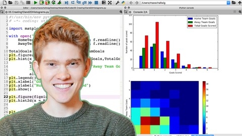
You’ll then dive into creating various 2D charts like line charts, bar charts (including grouped and stacked variations), scatter plots, pie charts, and donut charts.
You’ll also explore histograms, polar charts, and even dual-axis charts for comparing multiple datasets.
As you progress, you’ll master the Axis object to customize labels, ticks, and spines, giving you fine-grained control over your charts’ appearance.
The course then takes you deeper into statistical charting techniques.
You’ll learn how to create autocorrelation plots, KDE plots, boxplots, and violin plots.
You’ll also discover how to generate heatmaps and use colorbars effectively to visualize complex data patterns.
This section equips you with the skills to explore your data in more sophisticated ways.
Finally, you’ll be introduced to Seaborn, a powerful library built on Matplotlib.
You’ll learn to use Seaborn functions like regplot, countplot, barplot, boxplot, violinplot, and swarmplot to create visually appealing and insightful statistical visualizations.
You’ll also explore more advanced Seaborn tools like factorplot, distplot, jointplot, and pairplot to analyze relationships between different variables in your data.
The course concludes with a review of core elements like legends, ticks, patches, lines, annotations, PathCollections (for customizing scatter plot markers), and Axes Spines.
This ensures you have a solid grasp of all the fundamental tools for creating impactful data visualizations.
Mastering data visualization in D3.js
You’ll start by learning the fundamentals of D3 and how to set up your development environment.
From there, you’ll dive into creating basic visualizations like bar charts and scatter plots, mastering essential concepts like scales, axes, and data joins along the way.
As you progress, you’ll explore design principles to create clear and effective visualizations.
The course covers dynamic updates and transitions, allowing you to build interactive visualizations that respond to user input.
You’ll also learn how to create common chart types like line graphs, area charts, pie charts, and more.
The syllabus goes beyond traditional charts, teaching you how to visualize geographic data with maps and network diagrams.
You’ll work with hierarchical data structures to create tree diagrams, treemaps, and sunburst plots.
The course emphasizes best practices for file organization and code structure, preparing you to build complex, linked visualizations.
Throughout the course, you’ll apply your skills to real-world projects, such as creating a coffee shop dashboard, a Gapminder clone, a cryptocurrency tracker, and a corporate data dashboard.
These hands-on projects will solidify your understanding and give you practical experience in building data visualizations from scratch.
Data Visualization with Python for Beginners
This course begins by guiding you through the setup process, installing Anaconda and introducing you to the world of Jupyter Notebooks.
You will quickly learn to create basic visualizations like scatter plots and line plots using Matplotlib, the go-to library for all things visualization in Python.
You will not just learn to make these plots but will master the art of customizing them – think adding titles, labels, and even mathematical equations to make your graphs publication-ready.
You will then dive into the practical side of things.
You will learn to import data from different sources, including text files and CSV files, and then use this data to create insightful visualizations.
The course goes beyond the basics, teaching you how to add legends, annotations, and even customize the edges and overall style of your plots.
You will become comfortable working with histograms, bar graphs, and pie charts, essential tools for representing various data distributions and comparisons.
You will even learn to work with images and color scales, adding another layer of depth to your visualizations.
The course culminates with 3D graphing and animation, where you will bring your data to life with interactive and dynamic visualizations.
You will explore techniques like adjusting view angles to gain different perspectives on your data.
Data Visualization with Kibana

This course equips you with the skills to visualize and analyze data effectively using Kibana.
You’ll start by setting up Kibana on your preferred operating system - macOS, Linux, or Windows - and explore Elastic Cloud for easier management.
You’ll also learn to use the Console tool for tasks like creating index templates and importing test data.
The course then guides you through the Discover app, where you’ll master the Kibana Query Language (KQL) to filter and analyze data.
You’ll learn how to create data views (formerly index patterns) and transform them into powerful visualizations such as area charts, line charts, heat maps, and tag clouds.
You’ll discover how to customize these visualizations with features like dynamic ranges (histograms) for in-depth analysis.
You will then move on to dashboards, learning how to create interactive dashboards that combine different visualizations, link visualizations to saved searches for quick insights, and even apply saved queries to visualizations for greater control over data analysis.
Finally, the course covers essential security features.
You’ll learn about spaces, users, roles, and privileges, gaining the ability to create and manage users, configure roles, and secure your Kibana environment.
Also check our posts on: