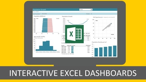
Excel dashboards are powerful tools for data visualization and analysis, enabling you to transform raw data into insightful, interactive reports.
They can be used to track key performance indicators (KPIs), monitor trends, and make data-driven decisions, making them essential for individuals and businesses alike.
Learning how to build effective Excel dashboards can significantly enhance your data analysis skills, allowing you to present information in a clear and engaging way.
Finding the right course to master this skill can be a challenge, with a vast array of options on platforms like Udemy.
You’re seeking a program that’s comprehensive, engaging, and covers both the technical aspects of dashboard creation and best practices for design and presentation.
For the best Excel dashboard course overall on Udemy, we recommend Visually Effective Excel Dashboards.
This course is a comprehensive guide to creating professional-looking dashboards with advanced charting techniques and interactive elements.
It goes beyond the basics, covering essential tools like PivotTables, slicers, and form controls, and teaches you how to incorporate advanced features like maps, infographics, and VBA code for automation.
The hands-on project building a KPI dashboard provides valuable practical experience.
While Visually Effective Excel Dashboards is our top pick, there are other excellent courses tailored to different learning styles and needs.
Keep reading to discover more options, ranging from beginner-friendly introductions to courses focused on specific data analysis scenarios like payroll or HR.
Visually Effective Excel Dashboards
You will start by learning the fundamentals of dashboard design, including layout, color schemes, and best practices for effective data visualization.
Next, you’ll dive into the essential Excel tools and techniques required for building dashboards.
This includes working with various data sources, mastering formulas like INDEX, MATCH, SUMIFS, and COUNTIFS, and leveraging features like form controls and pivot tables.
The course covers advanced charting techniques, allowing you to create dynamic and visually appealing graphs, such as maps and infographics.
One of the highlights is the step-by-step creation of a KPI (Key Performance Indicator) dashboard.
You’ll learn how to set up data sheets, create complex lookups, implement scrolling tables and charts, and incorporate interactive elements like combo boxes and check boxes.
This hands-on project will teach you how to design a professional and functional dashboard from start to finish.
Additionally, you’ll explore the power of pivot tables and slicers in creating interactive regional dashboards.
You’ll learn how to incorporate variance calculations, conditional formatting, and even integrate VBA code for automatic refreshing.
The course also covers advanced techniques like using shapes and the Excel camera tool to enhance your dashboard’s visual appeal.
Throughout the course, you’ll have access to practice files and drafts of the dashboards being built, allowing you to follow along and solidify your learning.
Microsoft Excel Data Analysis and Dashboard Reporting
You’ll start by learning how to clean and prepare raw data using functions like PROPER(), UPPER(), CHOOSE(), and TEXT().
This crucial step ensures your data is consistent and ready for analysis.
Next, you’ll dive into building an interactive Excel dashboard, starting with lookup functions like VLOOKUP() and the combo of INDEX() and MATCH().
These allow you to retrieve specific data points based on criteria.
The course then covers filtering techniques, including Advanced Filter and VBA code to dynamically update filters based on user selections.
To summarize and present data effectively, you’ll learn to use SUBTOTAL(), PivotTables, and Pivot Charts.
These tools make it easy to analyze data from different angles and create insightful visualizations.
The course even teaches you to link PivotTables to user selections using VBA, creating a truly interactive experience.
Interactive elements like Slicers are also covered, allowing users to filter chart data with a single click.
Finally, you’ll polish the dashboard by hiding unnecessary elements, resetting Slicers with VBA, and protecting the workbook.
You’ll learn essential Excel functions, VBA programming, and best practices for presenting data effectively.
Excel Interactive Dashboards and Data Analysis
You’ll start by mastering pivot tables, the foundation for creating interactive dashboards.
You’ll learn how to structure data correctly, work with multiple dimensions and measures, and filter and group data using Excel slicers.
The course then dives into building interactive dashboards, covering trend and time analysis techniques like using date groups and trend lines.
You’ll learn how to ask insightful questions of your data through filtering text, values, and dates, as well as performing top 10 analysis.
Creating visually appealing dashboards is also covered, including designing a sales dashboard and a financial dashboard with elements like pie graphs and conditional formatting using data bars, color scales, and icon sets.
The human resource data analysis section teaches you grouping, frequency analysis, and creating histograms for HR metrics.
Throughout the course, you’ll complete practical activities to solidify your learning, ensuring you can apply the concepts to real-world scenarios.
From mastering pivot tables to building comprehensive dashboards for sales, finance, and HR, this course equips you with a complete skillset for Excel data analysis and dashboard creation.
Excel Dashboard and Data Analysis Masterclass
You will learn how to design effective dashboards, build robust data models, and leverage various charting techniques to present data in a clear and compelling manner.
The course begins by introducing you to the concept of dashboards and their design principles.
You’ll learn how to structure your data, create date tables, and use shortcuts to work more efficiently.
The charting section covers a wide range of chart types, including advanced formatting options and conditional formatting techniques to highlight trends and outliers.
A significant portion of the course is dedicated to mastering Excel’s formula toolkit.
You’ll dive into functions like VLOOKUP, INDEX/MATCH, SUMIFS, SUMPRODUCT, and text functions, enabling you to manipulate and analyze data with ease.
The course also covers importing external data from various sources, ensuring you can work with data from different platforms.
Pivot tables and pivot charts are extensively covered, teaching you how to create interactive views, add slicers, and use the GETPIVOTDATA function.
You’ll also learn to create dynamic charts with drop-down lists, filters, and form controls, allowing users to interact with your dashboards.
The course includes several projects, such as building a Financial KPI Dashboard, a Balanced Scorecard Dashboard, a Business Sales Dashboard, and a KPI Dashboard.
These hands-on projects will reinforce your learning and provide you with practical experience in creating professional-grade dashboards.
Additionally, you’ll explore advanced techniques like dynamic heat maps using scroll bars, in-cell charts, top/bottom ranking charts, and panel charts for side-by-side time comparisons.
The course even covers interactive visualizations and maps using macros, as well as advanced topics like the rollover method and scroll/sort tables.
Microsoft Excel: Advanced Excel Dashboard Design
You will learn data visualization best practices, including the 10-second rule and the 3 key questions to ask when creating visuals.
The course covers essential chart types, formatting tips, and how to avoid common visualization mistakes.
When it comes to dashboard design, you’ll learn the principles, types of dashboards, defining a clear purpose, and using visual elements effectively.
The course includes four hands-on projects where you’ll create dashboards for companies like Maven Music, Maven Careers, Maven Toys, and Maven Hotel Group.
You’ll master techniques like selecting the right chart types, applying formatting, telling a story with data, preparing filters and interactivity, using conditional calculations, creating maps, setting up layouts, and using color strategically.
Pro tips are sprinkled throughout, teaching you advanced tricks like sorting based on formulas, grouping donut slices, splitting combo charts, dynamically highlighting series, and more.
This course doesn’t just teach you how to build dashboards, but also how to present data effectively.
You’ll learn to use titles, text, and visuals to convey a compelling narrative.
Excel with Interactive Excel Dashboards
The course starts by teaching you how to prepare your data and design effective dashboards following best practices.
You’ll learn various charting techniques like sparklines, bullet graphs, and small multiples to visualize trends and comparisons.
One of the highlights is mastering interactive controls like checkboxes, drop-downs, and scroll bars to make your dashboards dynamic.
The course dives deep into analyzing data with PivotTables, slicers, and formulas like GETPIVOTDATA to extract insights.
You’ll even learn to link dashboards to external data sources like Access.
Automating updates is covered in-depth, from refreshing PivotTables to running macros on workbook open.
The course equips you with techniques like INDIRECT and dynamic ranges to make your dashboards truly flexible.
You’ll also learn to distribute dashboards securely via the Excel Web App and password protection.
Throughout the course, supplementary lectures fill any knowledge gaps you might have with Excel essentials like formatting, formulas (VLOOKUP, INDEX/MATCH, IF statements), and more.
HR Analytics: How To Create An HR Dashboard Using Excel
This course starts by introducing the concept of an HR dashboard and showing typical examples, so you’ll understand what you’re working towards.
After the introduction, you’ll dive right into practical sessions where you’ll learn step-by-step how to create a simple HR dashboard in Excel.
The course covers essential Excel features for dashboard creation, like data visualization tools and PivotTables for analyzing employee data.
But it doesn’t stop at just a basic dashboard.
You’ll also learn how to make your dashboard interactive, with multiple sections covering the process in detail.
The course is very hands-on, with reading materials provided to supplement the practical sessions.
You’ll be creating dashboards from scratch using real employee data, so you’ll gain valuable experience.
Payroll Accounting With Visually Effective Excel Dashboards
The course starts by introducing you to payroll accounting and different types of pay heads.
You’ll learn essential Excel formulas and functions like VLOOKUP and data validation, with hands-on exercises to reinforce the concepts.
From there, you’ll dive into a payroll accounting example, followed by the five key steps involved in the process.
The course guides you through preparing the raw data sheet and the payroll sheet table, editing it as needed.
You’ll also learn how to record payroll accounting entries accurately.
One of the highlights is creating interactive dashboards using both the payroll sheet table and raw data table.
This practical skill is invaluable for visualizing and analyzing payroll data effectively.
Additionally, you’ll learn to prepare payslips and handle the preparation for the next month’s salary.
The course covers printing reports and includes a bonus section with extra content.
Easy Excel Dashboards, Models, Visualizations & Power Query
You’ll start by learning how to build a 20-minute dashboard without formulas, setting a strong foundation.
The course emphasizes structuring your work like a software developer, ensuring efficiency and maintainability.
You’ll dive into the essential concept of tidy data and learn how to use tables effectively.
The powerful Get & Transform (Power Query) feature will be covered, allowing you to automate data refreshes and merge data from multiple sources, eliminating the need for VLOOKUPs or database joins.
Modeling techniques are a key focus, with lessons on creating input driver sheets with named ranges, compensation cost modeling, and driver-based models.
You’ll also explore what-if analysis tools like Goal Seek, Solver, and Scenario Manager.
The course introduces you to advanced visualization techniques, including treemaps, sunbursts, and 3D maps, going beyond the standard charts in Excel.
Additionally, it compares the pros and cons of various data manipulation methods, such as VLOOKUPs, Power Query, database joins, OLAP, and even R programming.
Throughout the course, you’ll learn best practices for structuring and maintaining your Excel workbooks, ensuring they are scalable and easy to update.
Excel Dashboards | Visually Stunning Dashboards
The course starts by building your basic knowledge of Excel dashboards and their importance in business.
You’ll learn how to create and manage relevant business questions that your dashboard should answer.
Setting up the right environment is crucial, so the course guides you through that process.
Then, you’ll jump right into building your first dashboard, generating insights and choosing the appropriate charts to visualize the data effectively.
Proper alignment, sizing, and removal of distractions are covered to ensure a clean and visually appealing dashboard.
The course dives into leveraging slicers and timelines to add interactivity, as well as applying coloring and theming for a cohesive look.
Once you’ve mastered the basics, you’ll tackle a more complex dashboard using real-world data.
This involves managing blanks, views, and grouping techniques.
Contextual charting is explored to ensure your visualizations are meaningful and aligned with business objectives.
You’ll also learn advanced coloring methods and how to customize slicer colors for maximum impact.
Finally, the course guides you through summarizing insights and publishing your dashboard for others to use.
With hands-on practice files and a structured approach, this course seems ideal if you want to create visually stunning and insightful Excel dashboards from scratch.
The broad range of topics covered will equip you with the skills to design professional, interactive dashboards that drive better business decisions.
