Business analytics is a crucial skillset in today’s data-driven world.
It involves using data to gain insights, make informed decisions, and improve business outcomes.
By learning business analytics, you can unlock a world of opportunities, whether you’re looking to advance your career, start a new venture, or simply make smarter decisions in your personal life.
Finding the right business analytics course on Udemy can be a daunting task, with so many options available.
You’re looking for a course that’s comprehensive, engaging, and taught by experts, but also fits your learning style and goals.
Don’t worry, we’ve got you covered!
For the best business analytics course overall on Udemy, we recommend “SQL - MySQL for Data Analytics and Business Intelligence”.
This course covers everything you need to know about SQL and MySQL for data analytics and business intelligence, from the fundamentals to advanced topics like indexes, triggers, and window functions.
SQL is a foundational skill for business analytics, and this course provides a solid grounding in the language, along with practical examples and exercises to reinforce your learning.
While this is our top pick, there are other great options available on Udemy.
Keep reading for more recommendations for beginners, intermediate learners, and experts, as well as courses focusing on specific business analytics tools and techniques.
SQL - MySQL for Data Analytics and Business Intelligence

The course starts with the fundamentals, introducing you to databases, SQL as a declarative language, and the different types of SQL statements like DDL, DML, DCL, and TCL.
The course then dives into the intricacies of MySQL, covering topics like data types, constraints, coding techniques, and best practices.
One of the standout features of this course is its practical approach.
You’ll learn by working with real-world databases like the ’employees’ database, which allows you to practice and reinforce the concepts you’ve learned.
The course covers essential SQL statements like SELECT, INSERT, UPDATE, and DELETE, along with advanced topics like aggregate functions, joins, subqueries, self-joins, views, and stored routines.
The instructor does an excellent job of explaining complex concepts in a clear and concise manner, using visuals and examples to aid understanding.
The course also covers advanced topics like MySQL indexes, triggers, window functions, common table expressions (CTEs), and temporary tables, which are invaluable for data analysts and business intelligence professionals.
Additionally, the course includes a section on combining SQL and Tableau, which is a powerful data visualization tool.
You’ll learn how to transfer data from MySQL to Tableau and create insightful visualizations and dashboards, enhancing your data analysis and presentation skills.
Throughout the course, you’ll encounter exercises and quizzes that reinforce your learning and help you practice the concepts you’ve learned.
The instructor provides detailed solutions, ensuring that you understand the material thoroughly.
One of the unique aspects of this course is its focus on writing efficient and professional SQL code.
The instructor emphasizes coding techniques and best practices, which will be invaluable as you work on real-world projects.
Microsoft Excel: Business Intelligence w/ Power Query & DAX
This course teaches you how to use Excel’s powerful data modeling and business intelligence tools to connect, transform, and analyze large datasets.
It starts by introducing the “Power Excel” workflow, which involves using Power Query to connect and transform raw data sources, and then building relationships between tables in Excel’s data model.
You’ll learn how to apply basic table transformations, work with text, number, and date fields, and even create rolling calendars using custom M queries in the Excel Query Editor.
Next, you’ll dive into the principles of database normalization and learn how to structure efficient data models using table relationships instead of merged tables.
The course covers key concepts like cardinality, filter flow, and hiding fields from client tools like PivotTables.
With your data model built, you’ll learn how to analyze your data using Power Pivot and Data Analysis Expressions (DAX).
You’ll discover the differences between calculated columns and measures, and understand how to use DAX formula syntax and operators to create powerful calculated fields.
The course includes demos of key DAX functions for math, logic, text manipulation, and even time intelligence for calculating period-over-period changes or running totals.
Throughout the course, you’ll work with downloadable project files to practice your new skills.
The instructor shares best practices for Power Query, data modeling, and DAX development, and discusses topics like managing query performance and speed.
Finally, the course wraps up with an overview of data visualization options for your Excel data models, including PivotTables, Power View, and even Microsoft Power BI.
Statistics for Business Analytics and Data Science A-Z™
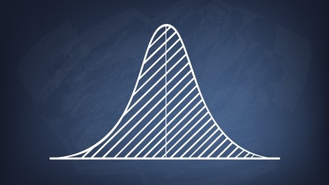
The course kicks off by diving into distributions, where you’ll learn the fundamentals of what a distribution is and how it’s used in data analysis.
You’ll explore the differences between continuous and discrete distributions, and gain a solid understanding of key concepts like standard deviation, normal distribution, skewness, and measures of central tendency such as mean, median, and mode.
Building on this foundation, the course then takes you on a journey through the Central Limit Theorem (CLT), a cornerstone of statistical inference.
You’ll discover the power of the CLT in action as you learn about populations, samples, and sampling distributions.
The course goes beyond just theory, providing intuitive explanations and visualizations to help you grasp the CLT’s significance.
You’ll even get hands-on with a CLT analytics challenge to cement your understanding.
With a solid grasp of distributions and the CLT, you’ll be ready to tackle hypothesis testing and statistical significance.
The course breaks down these concepts step-by-step, teaching you about p-values, the hypothesis testing process, rejection regions, and key assumptions.
You’ll learn how to conduct proportion testing and apply your skills through practical homework assignments.
But the course doesn’t stop at the basics.
It dives into advanced hypothesis testing topics like the Student’s t-distribution, t-tests, and the nuances of one-tailed and two-tailed tests.
You’ll even explore real-life examples and learn about common misuses and overuses of p-values to help you avoid pitfalls in your own analyses.
Throughout the course, you’ll have opportunities to test your knowledge with quizzes and apply your skills through hands-on exercises.
And if you ever get stuck, the course provides detailed homework solutions to help you work through challenging problems.
Advanced SQL: MySQL for Ecommerce & Web Analytics
You’ll start by ensuring you have the prerequisite SQL skills from the instructor’s “SQL Database for Beginners” course.
Once you’re up to speed, you’ll dive into setting up MySQL on your computer, whether you use a Mac or PC.
You’ll download MySQL Community Server and MySQL Workbench, then connect them for a seamless workflow.
The real fun begins when you analyze traffic sources for the fictional Maven Fuzzy Factory database.
You’ll find top sources, calculate conversion rates, optimize bids for paid traffic, and perform trend analyses with granular segments.
This practical approach will sharpen your SQL skills for real-world applications.
Website performance is another crucial area covered.
You’ll analyze top pages, entry pages, and bounce rates, and even test landing page variations.
Building conversion funnels and testing conversion paths will give you insights into user journeys.
Midway through, you’ll tackle a project that ties together everything you’ve learned so far.
Then, you’ll move on to channel portfolio management, analyzing seasonality and business patterns, and conducting in-depth product analyses, including sales, launches, website pathing, conversion funnels, cross-selling, and refund rates.
The course wraps up with a focus on user behavior, such as identifying repeat visitors, analyzing time between visits, channel preferences, and comparing new vs. repeat customer conversion rates.
Throughout the course, you’ll work with the Maven Fuzzy Factory database, giving you hands-on experience with real-world datasets.
The instructor provides assignments and solutions, so you can practice and reinforce your learning.
Introduction to Business Analytics
If you’re looking to gain a solid foundation in business analytics and learn how to apply it in a corporate setting, this course provides a well-structured path from the fundamentals to practical application.
The course begins by setting the scene, covering what to expect and how to manage the expectations of various stakeholder groups.
You’ll learn about preparing an annual business plan and a long-range plan, and understand the difference between analytics and analysis.
Next, the course dives into understanding your business through stakeholder mapping, defining business intelligence, and end-to-end process mapping.
You’ll gain an in-depth view of key processes like Hire-to-Retire (H2R), Source-to-Pay (S2P), Record-to-Report (R2R), and Order-to-Cash (O2C).
Target setting is a crucial aspect covered, where you’ll identify your firm’s key value drivers, differentiate between metrics and KPIs, define your own metrics, and learn the importance of benchmarking and data.
The course also explores the master data governance function.
As you progress, you’ll discover the maturity stages in analytics, from descriptive and diagnostic to predictive and prescriptive analytics.
The course then applies these concepts through practical analytics techniques like trend analysis, comparative analysis, value-based analysis, correlation analysis, time series analysis, regression analysis, machine learning, and natural language processing, all demonstrated using Excel.
The analytics life cycle is broken down step-by-step, covering hypothesis development, situational analysis, building a RACI matrix, current state analysis, blueprint and design, build and test, and deployment and operationalization.
You’ll learn what makes for a successful analytics project.
Data visualization is also given attention, equipping you with the skills to effectively communicate your findings.
The course culminates with a practical case study that ties together all the learnings.
Throughout the course, you’ll have opportunities to test your understanding through quizzes on topics like expectations, long-range and annual business plans, global process owners, target setting, maturity stages, and the various analytics techniques covered.
The hands-on approach using tools like Excel ensures you can immediately put your new skills into practice.
SAP Analytics Cloud - Master Class
The course starts with an introduction to the tool, covering essential skills like navigation, creating datasets, data preparation, exploration, and publishing.
As you progress, you’ll learn how to create a professional dashboard framework using stories, pages, profile settings, and style preferences.
The course provides a downloadable PDF on style preferences to ensure your settings match those used in the lectures.
You’ll also learn how to build a dashboard framework and create templates.
Next, you’ll dive into creating your first charts, including numeric point, bar charts, and time series charts.
The course also covers device preview to see how your dashboards will look on different devices.
Interactivity is a key focus, with lectures on linked analysis, filtering techniques (story, page, widget, measure, and time filters), variances, and tooltips.
As you advance, you’ll learn how to create more complex charts like pie charts, tree maps, scatterplots (with calculated measures), trellis charts (with restricted measures), heat maps (with aggregations and measure-based dimensions), and boxplots.
The course also covers advanced calculations, such as difference from calculation, date difference calculation, dimension to measure conversion, and calculated dimensions.
Higher-level interactivity topics include measure and dimension input controls, advanced filters, using hyperlinks (e.g., linking to MS Teams chats), creating a “Netflix effect” with KPI overviews, explorer mode, and commenting.
You’ll also learn how to work with tables, including calculations, thresholds, and tips for using tables in grid pages.
Geo maps are covered in detail, with lectures on data preparation and creating bubble, choropleth, and flow maps.
The course also teaches you how to share and publish your dashboards, covering favorites, catalog, bookmarks, and exporting to CSV, Excel, and PDF formats.
Advanced data preparation topics include copying elements between stories, data editing, data blending, updating datasets, and creating and updating models.
A unique aspect of this course is its coverage of augmented analytics, including smart insights, search to insight, smart discovery, and smart predict (for classification, regression, and time series).
The course concludes with a discussion of what makes a good dashboard.
Throughout the course, you’ll have the opportunity to test your knowledge with quizzes.
By the end, you’ll have a solid foundation in SAP Analytics Cloud and be able to create professional, interactive dashboards that provide valuable insights for your business.
Business Intelligence with Microstrategy 10 Analytics

The course starts with an introduction to MicroStrategy Desktop and guides you through the interface, ensuring you’re comfortable navigating the tool from the very beginning.
One of the key aspects of any business intelligence project is getting data into the system, and this course has you covered.
You’ll learn how to load data from various datasources, giving you the flexibility to work with the data you have available.
The hands-on exercise will solidify your understanding of the data loading process.
With your data loaded, it’s time to start building dashboards and visualizations.
This course dedicates a significant portion to this crucial skill, with six exercises to practice your dashboard creation abilities.
You’ll learn how to create a variety of visualizations, from basic charts to more advanced, interactive dashboards.
Along the way, you’ll also pick up design best practices to ensure your dashboards are not only informative but visually appealing and user-friendly.
Of course, the insights you uncover are only valuable if you can effectively share them with stakeholders.
The course covers basic reporting and presenting insights, teaching you how to communicate your findings clearly and concisely.
You’ll have the opportunity to practice this skill with an exercise before moving on to the final quiz.
Throughout the course, you’ll encounter quizzes to test your understanding and reinforce key concepts.
By the end, you’ll have a solid foundation in using MicroStrategy 10 for business analytics, empowering you to make data-driven decisions and share insights across your organization.
Marketing Analytics & Retail Business Management using Excel

The syllabus covers a wide range of topics essential for making data-driven decisions in retail and marketing.
The course begins with an introduction to forecasting, where you’ll learn the basics and create linear models using trendlines.
You’ll then dive into preparing data for regression models, which includes gathering business knowledge, exploring data, handling outliers, imputing missing values, transforming variables, and creating dummy variables for qualitative data.
The course also covers correlation analysis and creating correlation matrices in Excel.
Next, you’ll learn how to create simple and multiple linear regression models using the ordinary least squares (OLS) method.
You’ll assess the accuracy of predicted coefficients and the overall model using metrics like RSE and R-squared.
The course also teaches you how to handle special events like holiday sales and identify seasonality and trends for forecasting using additive and multiplicative models in Excel.
Market basket analysis is another key topic covered, where you’ll learn to calculate lift values and optimize store layouts.
The course introduces named ranges and the INDIRECT function in Excel to make your analyses more dynamic.
You’ll also learn how to perform RFM (recency, frequency, monetary) analysis to segment customers based on their purchasing behavior.
In the pricing section, you’ll learn about different pricing objectives and strategies like price bundling and non-linear pricing.
You’ll estimate demand using linear, power, and subjective demand curves in Excel.
The course also covers evaluating pricing strategies and solving bundling problems.
The final section focuses on customer lifetime value (LTV) and how to calculate it using Excel.
You’ll also learn to perform sensitivity analysis to understand how changes in key variables impact LTV.
Throughout the course, you’ll work with real-world data and learn to use Excel functions and charts to analyze and visualize your findings.
Tableau 2020 Training for Data Science & Business Analytics

This course guides you through the powerful features and capabilities of Tableau, one of the leading data visualization tools used by businesses and organizations worldwide.
It begins by introducing you to the fundamentals of Tableau, including installation, navigating the user interface, and understanding key terminologies.
You’ll dive right into analyzing real-world datasets, such as the Titanic survivor profiles and the Superstore dataset, gaining hands-on experience in creating insightful visualizations.
As you progress through the course, you’ll learn how to create a wide range of charts and graphs in Tableau.
From line charts and bar charts to area charts, treemaps, packed bubble charts, and even maps, you’ll master the art of presenting data in visually appealing and meaningful ways.
The course also covers advanced charting techniques like creating dual-axis charts and incorporating tooltips to enhance interactivity.
Tableau’s powerful filtering capabilities are explored in depth, enabling you to slice and dice your data based on specific criteria.
You’ll learn how to create simple filters, wildcard filters, conditional filters, and top/bottom filters to focus on the most relevant information.
Additionally, the course teaches you how to leverage groups and sets to further refine your analysis.
One of the key strengths of Tableau is its ability to create interactive dashboards.
The course dedicates an entire section to building dashboards, guiding you through the process of combining multiple charts, adding interactivity through action filters and highlight actions, and creating a cohesive and visually appealing dashboard that tells a compelling story with your data.
To take your Tableau skills to the next level, the course delves into calculated fields and parameters.
You’ll learn how to perform numerical calculations, create logical calculated fields, and use parameters to dynamically adjust filter settings and enable user selection.
These techniques will allow you to build more sophisticated and flexible visualizations.
The course also covers advanced topics such as table calculations and level of detail (LOD) expressions.
You’ll discover how to create percent and cumulative totals using table calculations and learn about the different types of LOD expressions: fixed, include, and exclude.
These concepts are then applied to create a Pareto chart, demonstrating their practical application.
Storytelling is a crucial aspect of effective data communication, and the course dedicates a section to creating stories and animated charts in Tableau.
You’ll learn how to use Tableau’s story layout to present a narrative using your data and incorporate animations to bring your visualizations to life.
Data preparation is an essential step in any analytics project, and the course provides a comprehensive overview of data cleanup techniques in Tableau.
You’ll learn how to remove unnecessary fields, rename fields, fix data types, split fields, filter data, create groups and aliases, and combine data from multiple sources using methods like manual union, automatic wildcard union, table joins, data blending, and data modeling.
Throughout the course, you’ll have the opportunity to test your knowledge and reinforce your learning through quizzes and hands-on challenges.
The final exam, consisting of 45 questions covering both theory and practice, will assess your understanding of the concepts covered and give you the confidence to apply your Tableau skills in real-world scenarios.
Tableau for Business Analytics and Marketing

This course takes you on a journey through applying Tableau to real-world marketing scenarios to drive business value and increase ROI.
You’ll dive right in with a buyer persona case study, where you’ll learn about different types of marketing data sources and how to connect to them in Tableau.
From there, you’ll build KPI indicators, create sales analysis visualizations, and visualize demographics to gain a deeper understanding of your target audience.
The course guides you through building an interactive dashboard to bring all these insights together.
Next, you’ll explore an environmental initiative use case, working with survey data in Tableau to uncover actionable insights and make data-driven recommendations.
Email marketing is a key focus, with a dedicated section on analyzing email performance.
You’ll create a treemap to visualize metrics, build a click-through rate bar chart, and use a heatmap to identify the best times and days for sending emails.
Investigating the master email list and digging into the data will help you uncover potential reasons for low engagement.
The course also covers marketing impact analysis, teaching you how to assess the effectiveness of promotions.
You’ll build sales visualizations and a promotional calendar, combining them into an insightful dashboard.
For those new to Tableau, the course includes a Tableau 101 section.
You’ll learn the difference between Tableau Desktop and Tableau Public (which you can download for free), understand dimensions vs. measures, and explore helpful features like the Show Me tab.
Throughout the course, you’ll work with real datasets which you can download and follow along with.
And by learning with Tableau Public, you can get hands-on practice without any cost.
With its practical use cases, key marketing metrics, and beginner-friendly Tableau tutorials, this course provides a well-rounded education in applying business analytics to marketing.