Finding a good data visualization course on Coursera can be overwhelming, especially with so many options to choose from.
You’re looking for a course that teaches you how to make sense of data and communicate your findings effectively.
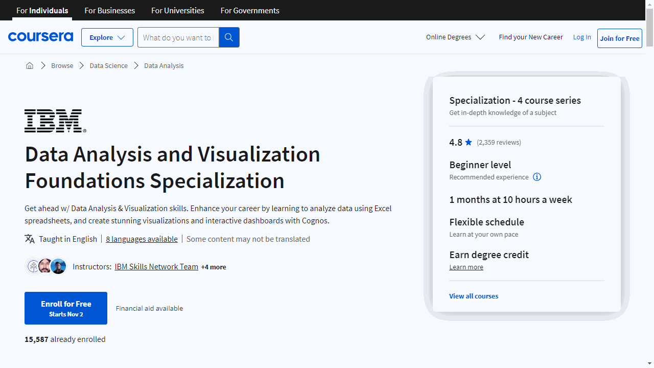
For the best data visualization course overall, we recommend Data Analysis and Visualization Foundations Specialization.
This specialization covers everything from the basics of data analysis to creating interactive dashboards using Excel and IBM Cognos Analytics.
It’s highly rated for its comprehensive approach and practical applications.
However, if you’re looking for something more specific, like a course on R or Tableau, or a course tailored to your experience level, we’ve got you covered.
Keep reading to explore our top picks for the best data visualization courses on Coursera, organized by tool, experience level, and specialization.
Best Data Visualization Courses For Beginners On Coursera
Data Analysis and Visualization Foundations Specialization

In this specialization, you’ll start with a gentle overview of data analysis and the data ecosystem, learning the difference between roles like Data Analyst, Data Scientist, and Data Engineer.
The first course covers the basics, walking you through key steps like gathering, cleaning, analyzing, and visualizing data.
You’ll also get exposure to essential big data tools like Hadoop and Spark. By the end, you’ll have completed a real-world data analysis scenario to practice your new skills.
From there, the Excel course provides hands-on data wrangling experience - no coding required.
You’ll gain proficiency in Excel by importing, formatting, and manipulating data. Key features like filtering, sorting, and pivot tables will transform scattered data into organized, readable information.
The final course brings together Excel and IBM Cognos Analytics to build interactive dashboards.
You’ll create simple charts like line and bar graphs before moving on to advanced visualizations like Treemaps and Sparklines. An Excel dashboard project lets you showcase these in-demand skills.
With a mix of video lessons and hands-on practice, this Specialization will give you a solid base in Excel, Cognos, and fundamental analysis skills to start a data analytics career.
The courses are aimed at beginners with no prior experience needed. By the end, you’ll have marketable abilities and a portfolio to show employers.
Data Literacy: Exploring and Visualizing Data Specialization
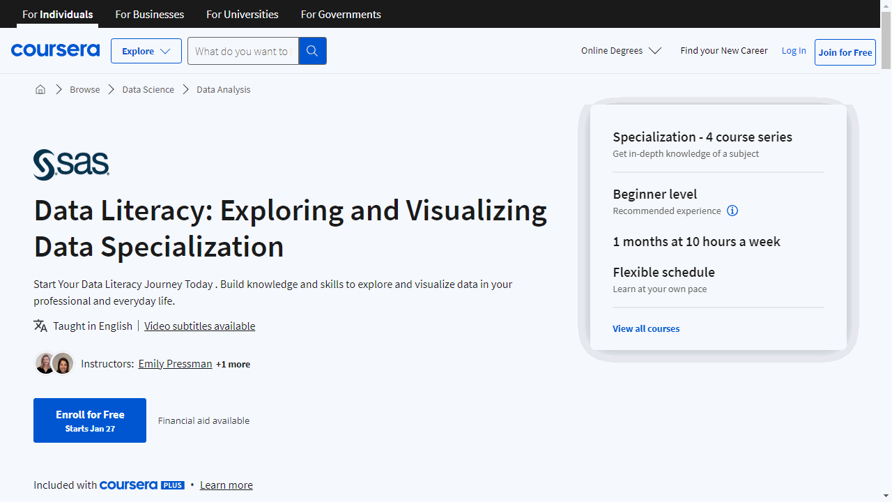
Provider: SAS
Whether your interest lies in public health, small business, or simply becoming more data literate, these courses equip you with the necessary skills to confidently navigate and leverage data.
The journey begins with “Data Literacy Essentials.” Ideal if you’re new to data, this course demystifies data literacy, explaining its significance and foundational concepts.
Through engaging scenarios related to the COVID-19 pandemic, you’ll learn to evaluate data’s utility, spot trends, make data-informed decisions, and communicate insights without getting bogged down by complex statistical terms.
It’s designed for easy understanding, ensuring anyone can grasp data literacy fundamentals.
“Data Literacy in Practice” builds on these basics by diving into data exploration and visualization.
You’ll follow a small business owner’s story, learning to prepare and analyze data, and use visualizations to reveal data relationships.
This course sharpens your ability to present findings clearly, making it perfect for applying data insights in practical settings.
For those keen on specific tools, “Getting Started with SAS Visual Analytics” introduces the SAS Visual Analytics and SAS Viya platforms.
It covers accessing, investigating, and preparing data for analysis, offering a solid start with these powerful analytical tools.
Continuing the tool-focused learning, “Data Analysis and Reporting in SAS Visual Analytics” deepens your skills in modifying data, performing analysis, and creating interactive reports using SAS Visual Analytics on the SAS Viya platform.
This course is excellent for enhancing your data analysis and reporting capabilities with SAS technologies.
This specialization is crafted to be accessible and supportive, focusing on practical skills and applications.
Best R Data Visualization Course On Coursera
Data Visualization & Dashboarding with R Specialization
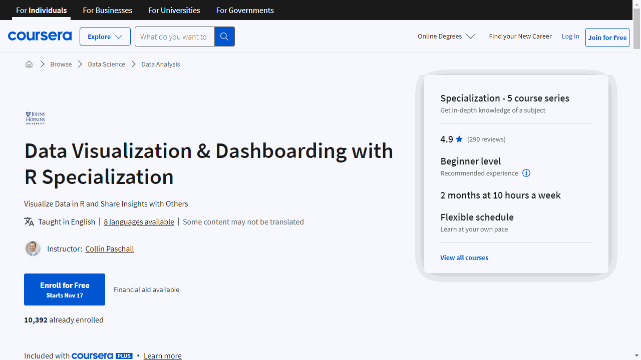
If you’re searching for a solid foundation in R programming with a focus on data visualization, the “Data Visualization & Dashboarding with R Specialization” on Coursera is a standout choice.
This series of courses is designed to equip you with the skills needed to turn data into compelling visual stories, a must-have ability in today’s data-driven world.
The journey begins with “Getting Started with Data Visualization in R.”
This course is tailored for those new to R, providing a gentle introduction to the language and its capabilities.
You’ll learn how to import data, use the tidyverse package for data manipulation, and create basic reports with R Markdown.
It’s an ideal starting point if you’re looking to get your feet wet without being overwhelmed.
As you progress to “Data Visualization in R with ggplot2,” you’ll build on your foundational knowledge.
This course zeroes in on the ggplot2 package, a versatile tool for crafting a wide array of visualizations.
You’ll learn to create and refine plots, focusing on the visual presentation of data rather than the underlying data management processes.
With “Advanced Data Visualization with R,” you’ll take your skills further.
This course introduces additional packages that enhance ggplot2, allowing you to create more sophisticated and varied visualizations, including spatial data representations and interactive elements.
It’s a deep dive into the possibilities of data visualization with R.
The fourth course, “Publishing Visualizations in R with Shiny and flexdashboard,” shifts the focus to sharing and presenting your work.
You’ll explore how to build interactive visualizations with Shiny and combine various R outputs into dashboards.
This course is about making your data not just insightful but also engaging and interactive for your audience.
The “Data Visualization Capstone” is the culmination of your learning experience.
Here, you’ll apply the skills you’ve acquired to a unique project, using real-world data to craft a narrative that’s both informative and visually appealing.
It’s your opportunity to demonstrate your ability to deliver a complete data visualization project from start to finish.
If you’re aiming to master data visualization in R, this specialization offers a structured and comprehensive path to achieving that goal.
Best Excel Data Visualization Course On Coursera
Excel Skills for Data Analytics and Visualization Specialization
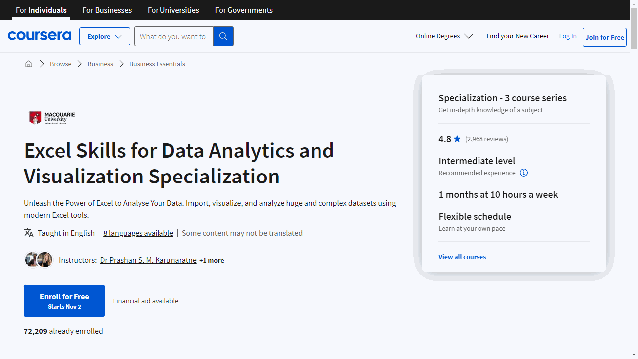
This hands-on Specialization provides you with the fundamental Excel skills you need to analyze and visualize data effectively.
The first course, Excel Fundamentals for Data Analysis, teaches you Excel essentials like data cleansing tools and functions to prepare your data for analysis.
You’ll automate repetitive tasks through Named Ranges and Tables, transforming and linking data using logical and lookup functions.
These fundamentals will boost your efficiency and build a strong data analytics foundation.
To turn your cleaned data into impactful insights, the Data Visualization in Excel course shows you how to leverage Excel’s visualization tools.
You’ll move beyond basic charts to create visualizations like sparklines, conditional formatting, and even animated charts to find the right story for your data.
Specialized charts, pivot tables, and interactive dashboards take your analysis to the next level.
The third course, Excel Power Tools for Data Analysis, introduces you to Power Query for automating data imports and preparation.
Analyze large datasets with Power Pivot, using a modeling language called DAX right inside Excel.
Finally, you’ll be introduced to Power BI to build stunning interactive reports and dashboards to share your data narrative with others.
The courses build on each other, so you get a comprehensive understanding of the data analysis process from data prep to visualization and communication.
If you want to maximize your data insights using Excel, this Specialization will empower you with the tools and techniques you need.
Best SAS Data Visualization Course On Coursera
SAS Visual Business Analytics Professional Certificate
Starting with “Getting Started with SAS Visual Analytics,” you’ll unlock the potential of the SAS Viya platform.
This course equips you with the know-how to navigate, explore, and prep data for deeper analysis, setting a solid foundation for your analytics journey.
Moving on to “Data Analysis and Reporting in SAS Visual Analytics,” you’ll refine your ability to manipulate data and craft interactive reports.
It’s about transforming raw data into compelling visual stories that can inform and persuade your audience.
In “Using Data for Geographic Mapping and Forecasting in SAS Visual Analytics,” you’ll learn to structure data for spatial analysis and forecasting.
You’ll create geo maps and forecasts, gaining the skills to visualize and predict trends with geographical context.
“Performing Network, Path, and Text Analyses in SAS Visual Analytics” teaches you to uncover hidden patterns and relationships through network, path, and text analytics.
This course helps you analyze complex data structures, revealing insights that aren’t immediately apparent.
Lastly, “Creating Advanced Reports with SAS Visual Analytics” takes your reporting to the next level.
You’ll learn to build advanced data items and dynamic reports, making your analyses more interactive and adaptable to different scenarios.
Best Advanced Data Visualization Course On Coursera
Information Visualization Specialization
Provider: New York University
This series guides you from the basics to advanced techniques, ensuring you master visualizing information effectively.
The journey begins with “Information Visualization: Foundations.”
Ideal for beginners or those seeking to solidify their base, this course introduces you to the essential vocabulary of visualization.
You’ll learn to describe and choose the right designs for various data problems, understand the field’s goals, methods, and applications, and practice making data descriptions useful for visualization.
Moving on, “Information Visualization: Applied Perception” delves into how we perceive visual information.
This course empowers you to create visualizations that are not just visually appealing but also effectively communicate data by leveraging human perceptual capabilities.
For those eager to dive into coding, “Information Visualization: Programming with D3.js” is your next step.
This course teaches you to use the D3.js library to create diverse and powerful visualizations.
From bar and line charts to complex maps and diagrams, you’ll learn to animate data on the web.
By the end, you’ll build a complete visualization system, showcasing airlines routes.
A basic understanding of programming and visualization is required, making this course suitable for enhancing your skills.
Finally, “Information Visualization: Advanced Techniques” introduces advanced visualization techniques for various data types, including temporal, spatial, networks, trees, and textual data.
You’ll explore different design solutions, learning their pros and cons, and how to innovate with D3.js.
This course also requires some foundational knowledge in programming and visualization.
Best Tableau Data Visualization Course On Coursera
Data Visualization with Tableau Specialization
Provider: University of California, Davis
Kick off with “Fundamentals of Visualization with Tableau” to grasp the basics of data visualization and get comfortable with Tableau’s interface.
You’ll install Tableau, learn to navigate its workspace, and start connecting to data sources.
This course is ideal if you’re new to Tableau or seeking a thorough refresher.
Move on to “Essential Design Principles for Tableau” to master the art of creating impactful visuals.
You’ll differentiate between exploratory and explanatory analysis, select the right visual forms for your data, and apply design principles to enhance clarity and effectiveness.
With “Visual Analytics with Tableau,” you’ll delve into more complex tools, including advanced chart types and custom maps.
You’ll learn to make informed choices about charting, work with dates, and perform table calculations, all to reveal deeper insights from your data.
“Creating Dashboards and Storytelling with Tableau” teaches you to craft compelling data narratives using dashboards and story points.
You’ll balance stakeholder goals with user needs and use Tableau’s advanced features to guide your audience through your data story.
Finally, the “Data Visualization with Tableau Project” is your chance to shine.
You’ll create a portfolio-worthy visualization or data story, applying all the skills you’ve acquired.
This project is your springboard to showcasing your Tableau prowess to the world.
Throughout these courses, you’ll build skills in visual analytics, interactive visualization, data virtualization, and storytelling.
You’ll also learn to evaluate data quality, develop KPIs, and write narratives that complement your visualizations.
By the end of this Specialization, you’ll not only understand Tableau inside out but also have a portfolio to demonstrate your expertise.
Tableau Business Intelligence Analyst Professional Certificate
This comprehensive 8-course Professional Certificate from Coursera can give you the hands-on training you need to succeed with Tableau.
These courses take you step-by-step through the key concepts, tools, and techniques used by business analysts.
It’s well-suited to beginners and intermediate learners alike.
You’ll start by building a strong foundation in analytics and data literacy.
Then you’ll dive into the business analysis process, learning how to assess problems, gather requirements, and implement solutions.
Crucially, you’ll also gain expertise in Tableau - one of the industry-leading platforms for interactive data visualization.
Through hands-on projects, you’ll master data preparation, visualization design, dashboard creation, and data storytelling.
These are pivotal skills for communicating insights and engaging stakeholders.
Other standout features include:
- Practical modules on managing data ecosystems and architecture principles
- Techniques for advanced visualizations like dual-axis charts and maps
- Data manipulation and analytics features to enhance analysis
- Design principles for crafting compelling, interactive presentations
By the end, you’ll have real-world skills to tackle business intelligence challenges.
The certificate can qualify you for entry-level analyst roles or help you stand out for promotions.
Plus, you can learn at your own pace, on any device.
Also check our posts on: