Tableau is a powerful data visualization tool that allows you to transform raw data into compelling and insightful dashboards and reports.
Mastering Tableau can be a game-changer for anyone working with data, whether you’re a data analyst, business intelligence professional, or simply looking to gain valuable insights from your data.
Learning Tableau can equip you with the skills to create interactive visualizations, build dashboards that tell compelling stories, and present your findings effectively to stakeholders.
Finding a comprehensive and engaging Tableau course on Coursera can be a challenging task, with so many options available.
You want a course that’s taught by experts, covers a wide range of topics, and provides practical experience to help you build real-world skills.
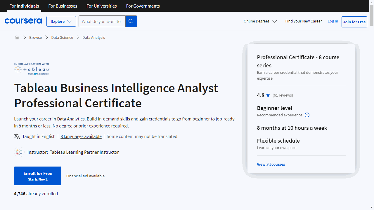
For the best Tableau course overall on Coursera, we recommend the Tableau Business Intelligence Analyst Professional Certificate.
This program consists of eight courses that provide a comprehensive introduction to business intelligence and data visualization principles using Tableau.
You’ll learn the fundamental concepts of data analysis, explore various data sources, and master the art of creating compelling visualizations and interactive dashboards.
The hands-on projects will solidify your learning and prepare you for real-world applications.
This is just one excellent option for learning Tableau on Coursera.
We’ve compiled a list of other highly-rated courses, focusing on different aspects of Tableau, from beginner-friendly introductions to advanced techniques, allowing you to find the perfect fit for your skill level and goals.
Keep reading to explore our curated selection of top-rated Tableau courses on Coursera!
Tableau Business Intelligence Analyst Professional Certificate

This comprehensive 8-course Professional Certificate from Coursera can give you the hands-on Tableau training you need to succeed.
These courses take you step-by-step through the key concepts, tools, and techniques used by business analysts.
It’s well-suited to beginners and intermediate learners alike.
You’ll start by building a strong foundation in analytics and data literacy.
Then you’ll dive into the business analysis process, learning how to assess problems, gather requirements, and implement solutions.
Crucially, you’ll also gain expertise in Tableau - one of the industry-leading platforms for interactive data visualization.
Through hands-on projects, you’ll master data preparation, visualization design, dashboard creation, and data storytelling.
These are pivotal skills for communicating insights and engaging stakeholders.
Other standout features include:
- Practical modules on managing data ecosystems and architecture principles
- Techniques for advanced visualizations like dual-axis charts and maps
- Data manipulation and analytics features to enhance your data analysis
- Design principles for crafting compelling, interactive presentations
By the end, you’ll have real-world skills to tackle business intelligence challenges.
The certificate can qualify you for entry-level analyst roles or help you stand out for promotions.
Plus, you can learn at your own pace, on any device.
Data Visualization with Tableau Specialization
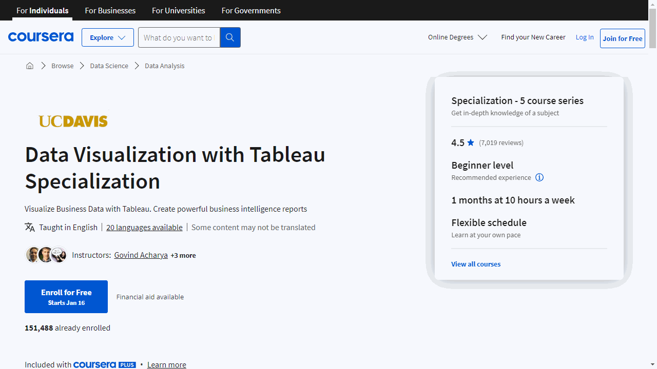
Provider: University of California, Davis
Kick off with “Fundamentals of Visualization with Tableau” to grasp the basics of data visualization and get comfortable with Tableau’s interface.
You’ll install Tableau, learn to navigate its workspace, and start connecting to data sources.
This course is ideal if you’re new to Tableau or seeking a thorough refresher.
Move on to “Essential Design Principles for Tableau” to master the art of creating impactful visuals.
You’ll differentiate between exploratory and explanatory analysis, select the right visual forms for your data, and apply design principles to enhance clarity and effectiveness.
With “Visual Analytics with Tableau,” you’ll delve into more complex tools, including advanced chart types and custom maps.
You’ll learn to make informed choices about charting, work with dates, and perform table calculations, all to reveal deeper insights from your data.
“Creating Dashboards and Storytelling with Tableau” teaches you to craft compelling data narratives using dashboards and story points.
You’ll balance stakeholder goals with user needs and use Tableau’s advanced features to guide your audience through your data story.
Finally, the “Data Visualization with Tableau Project” is your chance to shine.
You’ll create a portfolio-worthy visualization or data story, applying all the skills you’ve acquired.
This project is your springboard to showcasing your Tableau prowess to the world.
Throughout these courses, you’ll build skills in visual analytics, interactive visualization, data virtualization, and storytelling.
You’ll also learn to evaluate data quality, develop KPIs, and write narratives that complement your visualizations.
By the end of this Specialization, you’ll not only understand Tableau inside out but also have a portfolio to demonstrate your expertise.
Use Tableau for Your Data Science Workflow Specialization
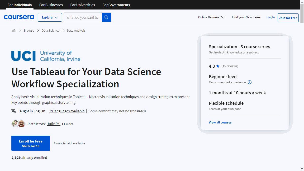
Provider: University of California, Irvine
“Data Visualization Best Practices” is your starting point.
It’s all about making data visualization work for you.
You’ll grasp the essentials of why and how to visualize data effectively.
You’ll jump into Tableau, set things up, and begin exploring data, specifically diving into the S&P 500 stock sectors.
Then, “Data Storytelling” takes you beyond the basics.
Here, you’ll connect the dots between visuals and the stories they tell.
You’ll learn to sidestep common pitfalls that can skew your data’s message.
In Tableau, you’ll tackle more intricate datasets, engaging in multivariate analysis of the S&P 500 stock sectors.
Lastly, “Dashboarding and Deployment” brings it all together.
You’ll master the art of dashboard creation, focusing on design and functionality.
You’ll also learn to share your insights by deploying and publishing your visualizations.
Your capstone project will be an informative dashboard showcasing financial market trends against economic indicators.
Each course builds on the last, ensuring you develop a robust understanding of Tableau’s role in data visualization and storytelling.
Frequently Asked Questions
What Is The Difference Between Tableau Desktop And Tableau Online?
Tableau Desktop and Tableau Online are both data visualization tools, but they cater to different needs.
Tableau Desktop is a software program you install on your own computer.
This gives you complete control over your data and analysis, allowing for in-depth exploration and customization.
It’s ideal for individual analysts who need maximum flexibility.
Tableau Online, on the other hand, is a cloud-based service.
You access it through a web browser, making it easy for teams to collaborate on visualizations and dashboards.
It also scales well for sharing insights with a wider audience.
So, if accessibility and teamwork are priorities, Tableau Online is the better choice.