
Are you trying to create a regression model using the LightGBM library in Python but finding it challenging?
Perhaps you’re unsure about installing the library, setting up the model, preparing the data, or evaluating your model’s performance.
You’re in the right place.
This tutorial will guide you through each of these steps.
We’ll install LightGBM, prepare a dataset, train a model, make predictions, and evaluate the results.
By the end, you’ll have a functional LightGBM regression model and a solid understanding of the process.
Let’s get started.
Installing LightGBM in Python
Before we dive into the main content of this tutorial, let’s first ensure that you have the LightGBM library installed in your Python environment.
You can install LightGBM either using conda or pip.
If you’re using an Anaconda distribution, you can install LightGBM by using the following command in your terminal:
conda install -c conda-forge lightgbm
If you prefer using pip, run this command:
pip install lightgbm
After running one of these commands, LightGBM should be installed and ready for use in your Python environment.
Regression Loss Functions in LightGBM
LightGBM offers a variety of loss functions to optimize for regression applications.
Each of these loss functions has specific use cases and characteristics.
Let’s explore each one briefly.
L2 Loss
Also known as Mean Squared Error (MSE) or RMSE (Root Mean Squared Error), L2 loss calculates the square of the difference between the actual and predicted values. It is sensitive to outliers because it squares the error.
L1 Loss
L1 loss, or Mean Absolute Error (MAE), calculates the absolute difference between the actual and predicted values. Unlike L2, it is not very sensitive to outliers.
Huber Loss
Huber loss is a combination of L1 and L2.
It calculates the squared error for smaller errors and absolute error for larger errors.
This makes it less sensitive to outliers than L2 while retaining some of its properties.
Fair Loss
Fair loss is a less sensitive version of L1 loss.
It is even more robust to outliers and can be useful when outliers are expected but not desired to have a large impact.
Poisson Regression
Poisson regression is used for datasets where the target variables are counts.
It assumes that the response variable has a Poisson distribution.
For example, let’s say you’re working with a dataset of traffic data, and you want to predict the number of traffic incidents that will occur in a particular area based on factors like weather conditions, day of the week, and time of day.
Here, your target variable (number of incidents) is a count, which makes Poisson regression a good fit.
Quantile Regression
Quantile regression is beneficial when you’re interested in predicting an interval rather than a specific value.
For instance, consider a real estate pricing model.
Instead of predicting a single price, you might want to provide a range (lower and upper bounds) to account for various factors and uncertainties.
Here, a quantile regression model could be used to predict the 10th and 90th percentiles, giving you a range of potential prices.
MAPE Loss
Mean Absolute Percentage Error (MAPE) loss calculates the percentage difference between the actual and predicted values.
It is often used in forecasting problems.
Gamma and Tweedie Regression
Gamma and Tweedie regression are good when you have a dataset with lots of zeros but you still want to predict positive values.
The insurance industry uses this family of loss functions to model insurance claims, which are mostly zero (people don’t make claims very often) but must be accurately predicted when they do occur.
Preparing the Data
Before we can begin building our LightGBM model, we first need to prepare our data.
This involves loading in our dataset and splitting it into training and validation sets.
We’ll be using the Red Wine Quality dataset for this tutorial. For convenience, we’ll download it from an online source using pandas.
This dataset contains 11 features that describe the physicochemical properties of different red wines and a quality score between 3 and 8 for each.
The goal is to build a model that can predict the quality of a wine based on the recorded properties.
Pandas is a powerful data manipulation library in Python. It allows us to read a CSV file from a URL directly.
import pandas as pd

# URL of the dataset
url = "https://archive.ics.uci.edu/ml/machine-learning-databases/wine-quality/winequality-red.csv"

# Use pandas to read the CSV file
df = pd.read_csv(url, sep=';')

df.head()
| fixed acidity | volatile acidity | citric acid | residual sugar | chlorides | free sulfur dioxide | total sulfur dioxide | density | pH | sulphates | alcohol | quality |
|---|---|---|---|---|---|---|---|---|---|---|---|
| 7.4 | 0.7 | 0 | 1.9 | 0.076 | 11 | 34 | 0.9978 | 3.51 | 0.56 | 9.4 | 5 |
| 7.8 | 0.88 | 0 | 2.6 | 0.098 | 25 | 67 | 0.9968 | 3.2 | 0.68 | 9.8 | 5 |
| 7.8 | 0.76 | 0.04 | 2.3 | 0.092 | 15 | 54 | 0.997 | 3.26 | 0.65 | 9.8 | 5 |
| 11.2 | 0.28 | 0.56 | 1.9 | 0.075 | 17 | 60 | 0.998 | 3.16 | 0.58 | 9.8 | 6 |
| 7.4 | 0.7 | 0 | 1.9 | 0.076 | 11 | 34 | 0.9978 | 3.51 | 0.56 | 9.4 | 5 |
This code will load the dataset into a pandas DataFrame.
The head() function is used to display the first few rows of the DataFrame.
Splitting the Data into Training and Validation Sets
Now that we have our dataset, we need to split it into a training set and a validation set.
This is a crucial step in machine learning, as it allows us to evaluate our model’s performance on unseen data.
We’ll use the train_test_split function from the sklearn.model_selection module to do this.
We’ll use 80% of the data for training and 20% for validation.
from sklearn.model_selection import train_test_split

# Define our target variable
y = df['quality']

# Define our feature variables
X = df.drop('quality', axis=1)

# Split the data
X_train, X_val, y_train, y_val = train_test_split(X, y, test_size=0.2, random_state=42)
In this code, we first define our target variable, which is the ‘quality’ column in our dataset.
We then define our feature variables by dropping the ‘quality’ column from our DataFrame.
Finally, we split our data into training and validation sets using the train_test_split function.
Building the LightGBM Model
With our data prepared, we can now move on to building our gradient boosting model using LightGBM.
It’s worth noting that LightGBM can also be used to build classifiers.
Defining the Model
To build our regression model, we’ll use the LGBMRegressor class from the lightgbm module.
This class provides a lot of hyperparameters that you can tune to improve your model’s performance.
But for this tutorial, we’ll stick to the default parameters.
from lightgbm import LGBMRegressor

# Define the model
model = LGBMRegressor(random_state=42)
In this code, we import the LGBMRegressor class from the lightgbm module and create an instance of it, which we assign to the variable model.
We set the random_state parameter to ensure that our results are reproducible.
Training the Model
Now that our model is defined, we can train it on our training data.
We do this using the fit method of our model, passing in our training data and labels.
# Train the model
model.fit(X_train, y_train)
This code will train our LightGBM model on our training data.
The fit method builds sequential decision trees to minimize the difference between the model’s predictions and the actual values.
Making Predictions
Once training is complete, the next step is to make predictions on our validation data and evaluate how well our model is performing.
We can use the predict method of our model to make predictions.
We’ll pass in our validation features to this method, and it will return a list of predicted values.
# Make predictions
y_pred = model.predict(X_val)
This code will predict the wine quality for each sample in our validation set.
Evaluating the Model’s Performance
After making predictions, we need to evaluate how accurate our model is.
For regression tasks, common metrics include the Root Mean Squared Error (RMSE) and the Mean Absolute Error (MAE).
RMSE gives us the root of the average of the squared differences between the predicted and actual values.
It will give higher weight to larger differences, which tends to be useful when you care about outliers.
MAE, on the other hand, is the average over the test sample of the absolute differences between predictions and actual observations, which doesn’t grow so fast on large differences.
Let’s calculate both of these:
from sklearn.metrics import mean_squared_error, mean_absolute_error
import numpy as np

# Calculate RMSE
rmse = mean_squared_error(y_val, y_pred, squared=False)
print(f"RMSE: {rmse}")

# Calculate MAE
mae = mean_absolute_error(y_val, y_pred)
print(f"MAE: {mae}")
This code first calculates the RMSE and then the MAE of our model’s predictions.
The mean_squared_error and mean_absolute_error functions from the sklearn.metrics module are used to calculate these metrics.
If you pass in squared=True to the mean_squared_error function, it will return the MSE instead of the RMSE.
Visualizing the Results
Visualizing our results can often give us a better understanding of how well our model is performing.
One common way to do this for regression tasks is to plot our model’s predicted values against the actual values.
Plotting Actual vs Predicted Values
We’ll use matplotlib, a popular data visualization library in Python, to create this plot.
We’ll create a scatter plot, with the actual values on the x-axis and the predicted values on the y-axis.
import matplotlib.pyplot as plt

# Create a scatter plot
plt.scatter(y_val, y_pred, alpha=0.5)

# Add title and labels
plt.title('Actual vs Predicted Values')
plt.xlabel('Actual Values')
plt.ylabel('Predicted Values')

# Show the plot
plt.show()
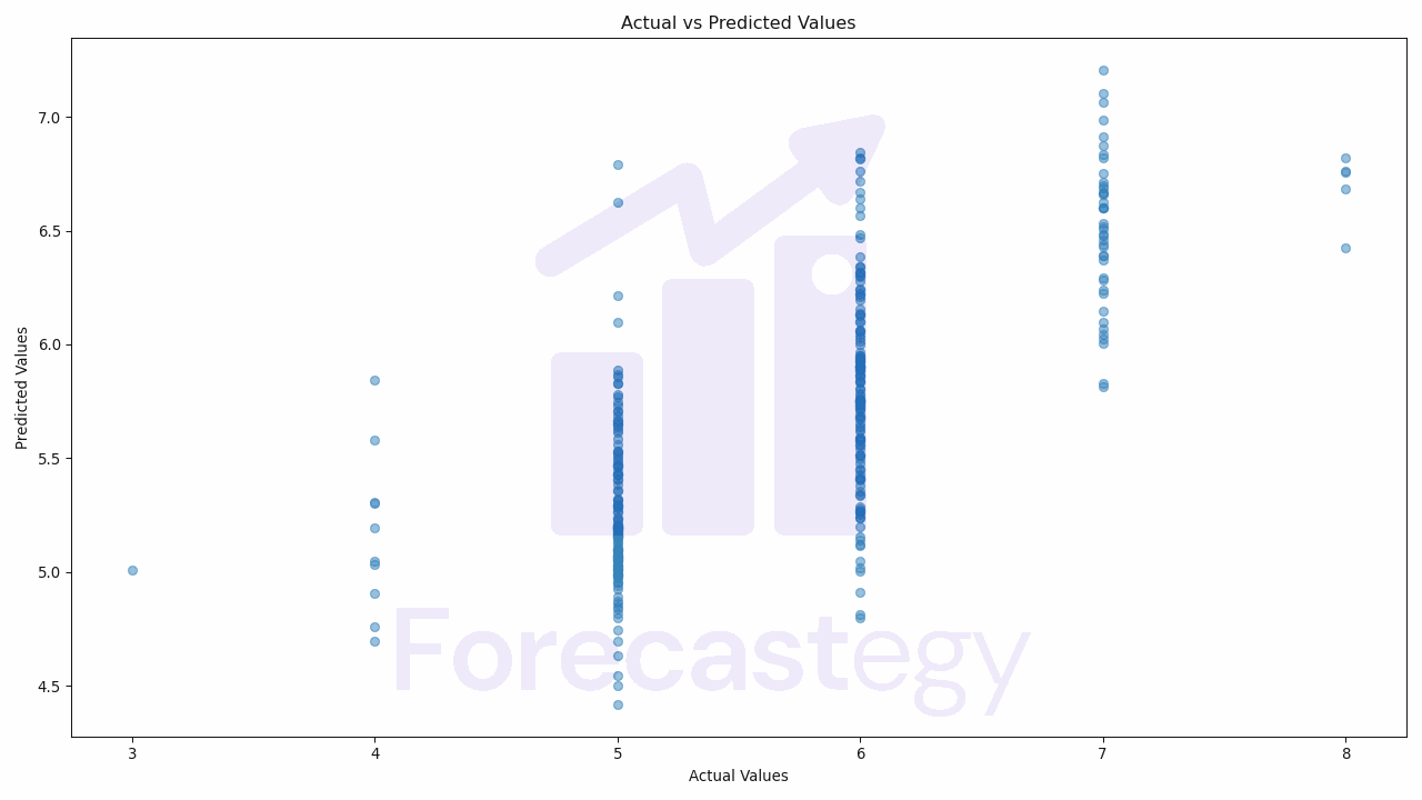
In this code, we first import the matplotlib.pyplot module.
We then create a scatter plot using the scatter function, passing in our actual and predicted values.
We set the alpha parameter to 0.5 to make the points semi-transparent, which helps us see the density of the points better.
We then add a title and labels to our plot using the title, xlabel, and ylabel functions, and finally show the plot using the show function.
If our model is performing well, we should see a strong positive correlation between the actual and predicted values, meaning that the points should roughly form a diagonal line from the bottom left to the top right of the plot.