
Data analytics is the process of examining data to extract meaningful insights and support informed decision-making.
It’s a crucial skill in today’s data-driven world, allowing you to make sense of vast amounts of information and discover trends, patterns, and anomalies.
By mastering data analytics, you can unlock opportunities in various fields, including business, finance, healthcare, and research.
Finding the right data analytics course on Udemy can be overwhelming, with countless options vying for your attention.
You’re looking for a course that’s comprehensive, engaging, and taught by experienced professionals who can guide you through the complexities of data analysis.
For the best data analytics course overall on Udemy, we recommend “Data Analysis with Pandas and Python”.
This course stands out for its comprehensive approach, covering everything from Python fundamentals and data manipulation with pandas to visualization and real-world case studies.
The instructor, Boris Paskhaver, provides clear explanations and practical exercises, making the learning process both enjoyable and effective.
While “Data Analysis with Pandas and Python” is our top pick, there are other excellent options on Udemy tailored to different learning styles and goals.
Whether you’re a beginner seeking a gentle introduction or an experienced programmer looking to delve deeper into specific techniques, we have recommendations for you.
Keep reading for our full list of data analytics courses, and find the perfect one to kickstart your data analysis journey!
Tableau A-Z: Hands-On Tableau Training for Data Science

The course starts by getting you set up with Tableau and the necessary datasets.
Then, it dives into the basics of creating visualizations like bar charts, adding colors and formatting.
From there, it covers more advanced topics like working with time series data, understanding aggregation and level of detail, and creating filters.
You’ll learn how to make maps, scatter plots, and dashboards with interactive actions.
The course goes deep into joining and blending data from multiple sources, as well as using the new relationships feature in Tableau 2020.2.
It teaches you how to create dual-axis charts and calculated fields within blends.
You’ll master table calculations, parameters, tree maps, and customer segmentation dashboards with advanced interactivity.
It even covers data prep tasks like pivoting, splitting columns, and fixing geographic data issues.
Later sections cover advanced topics like creating custom territories, clustering, cross-database joins, modeling with clusters, and new mobile design features.
You’ll learn the latest Tableau capabilities for connecting to PDFs and spatial files, step/jump line charts, and tooltips with vizzes.
The course wraps up with a roadmap for continued learning.
Power BI A-Z: Hands-On Power BI Training For Data Science!

The course kicks off by welcoming you with an installation guide and dataset resources.
You’ll then dive straight into creating your first bar chart in Power BI, learning how to connect to data files like CSV, navigate the interface, drill down hierarchies, add colors, calculated columns, labels, and formatting.
Next, you’ll explore time series data, understanding aggregation and granularity.
You’ll create an area chart, learn about highlighting, and work with filters and slicers.
This hands-on approach ensures you grasp these core concepts thoroughly.
Moving on, you’ll join datasets using different join types (LEFT, RIGHT, INNER, OUTER) and handle duplicate values or multiple join fields.
You’ll then create maps, leveraging hierarchies, latitudes, and longitudes, and learn the difference between calculated columns and measures through examples.
The course also covers creating scatter plots, combining charts, filters, and slicers for interactive reports.
You’ll even add a donut chart to enhance your visualizations.
In the next section, you’ll build an interactive Business Intelligence report from scratch.
You’ll map geographical roles, create table calculations for gender, and bin distributions for age and balance.
Additionally, you’ll learn to create a treemap chart and a customer segmentation dashboard, controlling report interactivity.
To take your skills further, you’ll leverage custom visuals like chord charts to visualize the European Debt Crisis.
Kirill will guide you through installing custom visuals, understanding chord chart mechanics, setting up multiple views, and adding treemaps for deeper insights.
Throughout the course, quizzes reinforce your learning, ensuring you grasp each concept before progressing.
Beginner’s Guide to Data & Data Analytics, by SF Data School

The course starts by setting the stage with an introduction to data.
It provides a big picture view of the data world, answering fundamental questions like why data is important now, what data is, where it comes from, who uses it, and what it’s used for.
This lays the groundwork for understanding the context and significance of data.
Next, it differentiates between the roles and skills of data professionals, specifically data analysts, data scientists, and data engineers.
You’ll learn how each role provides value and fits into the overall data landscape.
This clarity is crucial for understanding where your interests align and what path to pursue.
The course then dives into the classification of data analytics tools.
With the vast array of tools available, it’s essential to navigate this landscape efficiently.
The course introduces a classification system to help you find your bearings quickly and understand the associated terminology.
One of the core topics is the “Data Analytics Tool Triangle,” which focuses on spreadsheets, databases & SQL (query languages), and business intelligence (BI) software.
You’ll explore the functionality, use cases, similarities, and differences between these tools, and how they work together in data analytics.
Understanding data types, files, and formats is also covered, as their attributes and properties significantly impact your ability to leverage data tools effectively.
Real-world examples illustrate the importance of these concepts.
The course then explains data pipelines, which is the process of how data moves from collection to analysis.
Grasping this concept empowers you to understand the journey data takes before reaching your hands for analysis.
To solidify your understanding, the course includes a “Data Flashcards” section, breaking down key concepts and terminology in a concise, flashcard-style format.
Finally, the course provides a data analytics learning roadmap and discusses relevant career paths.
This guidance helps you plan your next steps and align your learning with your career goals.
SQL Masterclass: SQL for Data Analytics

The course starts by introducing you to SQL and its importance in managing and analyzing data efficiently.
You’ll learn how to install PostgreSQL and pgAdmin, a graphical interface for writing and running SQL queries.
The course then dives into a case study, where you’ll tackle real-world business problems faced by an e-commerce company, such as selecting marketing channels, optimizing warehouse inventory, and maximizing revenue.
Next, you’ll learn the fundamental SQL statements, including CREATE, INSERT, SELECT, UPDATE, DELETE, and ALTER.
The course covers various techniques for filtering and sorting data, such as using the WHERE clause, logical operators, IN, BETWEEN, and LIKE statements.
You’ll also explore ordering data with ORDER BY and LIMIT clauses, and learn how to use aliases to improve query readability.
The course then delves into aggregate functions like COUNT, SUM, AVG, MIN, and MAX, which are essential for data analysis.
You’ll learn how to group data using the GROUP BY clause and apply conditions on aggregated data with the HAVING clause.
Additionally, you’ll discover how to use conditional statements with CASE WHEN to categorize data based on specific conditions.
One of the most crucial topics covered is joins, which allow you to combine data from multiple tables.
You’ll learn about different types of joins, including inner, left, right, full outer, and cross joins, as well as how to use set operators like UNION, INTERSECT, and EXCEPT.
The course also covers subqueries, which enable you to nest queries within queries for more complex data retrieval.
The course introduces you to views, virtual tables that provide controlled access to data without exposing the entire database.
You’ll also learn about indexes, which optimize database retrieval speed.
Additionally, you’ll explore string functions like LENGTH, UPPER, LOWER, REPLACE, TRIM, CONCATENATION, and SUBSTRING, as well as mathematical functions like CEIL, FLOOR, RANDOM, ROUND, and POWER.
Date-time functions are covered in-depth, including extracting components like day, hour, and minute from timestamps, calculating age, and working with the CURRENT DATE and TIME functions.
The course also covers pattern matching using regular expressions, enabling you to identify strings adhering to specific formats.
Window functions are introduced, which allow you to perform calculations across multiple rows without aggregating data.
You’ll learn about functions like ROW_NUMBER, RANK, DENSE_RANK, NTILE, AVG, COUNT, SUM, LAG, and LEAD, which are essential for advanced data analysis.
The course also covers performance tuning tips, such as using the EXPLAIN statement to evaluate query performance, utilizing case statements instead of update statements for efficient data modification, and leveraging the VACUUM statement to remove soft-deleted rows.
Best practices for using string functions, joins, and schemas are also discussed.
Finally, the course provides an overview of database basics, including the different types of SQL commands (DDL, DML, DQL, DCL, and Transactional Control Commands), and an introduction to PostgreSQL, its features, and its advantages for data analytics.
Microsoft Excel: Data Analysis with Excel Pivot Tables
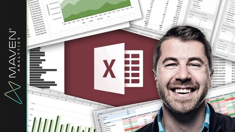
The course starts by introducing you to pivot tables and explaining why they are such a powerful tool for data analysis in Excel.
You’ll learn how to structure your data properly and create your first pivot table.
Next, you’ll dive into formatting pivot tables, including number formats, layouts, styles, and conditional formatting.
This will allow you to present your data in a clear and visually appealing way.
The course then covers sorting, filtering, and grouping data within pivot tables.
You’ll learn how to use label filters, value filters, slicers, and timelines to slice and dice your data.
Grouping techniques will enable you to combine and aggregate data as needed.
One of the most valuable sections teaches you how to enrich your data using calculated fields and values within pivot tables.
You’ll be able to define new metrics, perform various calculations, and even insert formulas - unlocking deeper insights.
Visualizing data is key, so you’ll learn how to create and customize pivot charts like column, pie, bar, and area charts.
This allows you to transform your pivot table data into impactful visuals.
The course provides extensive practice through case studies analyzing real-world datasets like U.S. voter demographics, San Francisco salary data, shark attack records, stock market data, baseball team statistics, burrito ratings, weather conditions, Facebook metrics, and wine tasting scores.
Throughout the lectures, you’ll pick up pro tips on dealing with growing data, using wildcard filters, creating dynamic dashboards, and more
Microsoft Excel: Data Visualization, Excel Charts & Graphs
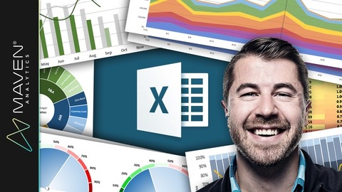
You’ll start by learning the fundamental principles of effective data viz, like minimizing noise and striking the right balance between design and function.
From there, you’ll dive into mastering the 20+ chart types in Excel through interactive demos and hands-on exercises.
Whether it’s bar charts, histograms, line graphs with trendlines, area charts, pies, scatter plots, or more advanced visuals like waterfall, funnel, radar, and 3D contour charts - this course covers it all using Excel 2016 and Office 365.
But it doesn’t stop at just the basics.
You’ll also learn next-level techniques to create truly powerful and interactive visualizations.
Things like building custom image overlay charts, highlighting date ranges using binary values, automating charts with named ranges and OFFSET/COUNTA functions, and adding scroll/zoom capabilities with form controls.
The demos really kick it up a notch, walking you through dynamic dashboards, charts that format based on values, visualizing percentages using array functions, and even designing custom gauge charts by combining trigonometry with scatter plots.
You’ll gain skills to transform plain data into engaging, best-in-class visuals.
Python A-Z: Python For Data Science With Real Exercises!

This course begins by walking you through installing Python, Anaconda, and Jupyter Notebook on Windows or MAC.
You’ll get the datasets needed for hands-on practice right away.
The first major section dives into core programming principles like variables, Boolean operators, loops, and if statements - the building blocks of coding.
You’ll apply these concepts by analyzing the law of large numbers through homework.
Next, you’ll explore Python fundamentals: lists, tuples, functions, packages like Numpy for arrays, and array slicing.
Another homework lets you analyze financial statements.
The course then moves into matrices - vital for data science.
You’ll build and operate on matrices, create visualizations, design functions, and gain insights into basketball data through exercises.
Data frames and Pandas are up next.
You’ll import datasets, explore them, rename columns, subset, filter, and visualize with Seaborn.
The homework analyzes world trends.
Advanced visualization techniques like histograms, KDE plots, subplots, violin/box plots, and facet grids follow.
You’ll style plots and even build dashboards!
The homework dissects movie grosses.
Finally, you’ll get detailed video solutions for all the homework assignments to reinforce concepts.
By the end, you’ll have a solid grasp of using Python for data analysis and visualization - a crucial data science skill.
Data Analysis with Pandas and Python

This comprehensive course covers everything you need to master data analysis using Python’s powerful pandas library.
The syllabus starts by guiding you through installing the Anaconda distribution and setting up your coding environment.
You’ll learn how to use Jupyter Notebooks, an interactive platform for writing and executing Python code.
The course then dives into a crash course on Python basics like data types, variables, functions, lists, and dictionaries.
This ensures you have a solid foundation before moving on to pandas.
You’ll thoroughly explore the pandas Series and DataFrame objects, which are essential for working with structured data.
The syllabus covers creating, filtering, sorting, and manipulating these objects using a wide range of methods and techniques.
You’ll learn how to handle missing data, perform mathematical operations, work with text data, and more.
The course also covers advanced pandas topics like MultiIndexes for handling hierarchical data, GroupBy operations for grouping and aggregating data, and merging/joining multiple datasets.
You’ll learn how to work with dates and times, import/export data from various file formats, and create visualizations like line charts and bar graphs using matplotlib.
Throughout the syllabus, you’ll work with real-world datasets, ensuring you gain practical experience.
The lessons are designed to be clear and concise, with transitions to help the content flow naturally.
You’ll be writing as if speaking directly to the reader, using a conversational yet technical tone.
Learning Python for Data Analysis and Visualization Ver 1

The course starts by ensuring you have Python and necessary modules set up on your computer.
You’ll then dive into learning NumPy for array creation and manipulation, a fundamental skill for data analysis.
The course guides you through creating arrays, performing operations on them, indexing, transposing, and processing arrays.
Next, you’ll learn about the powerful pandas library, which is essential for data analysis in Python.
You’ll work with pandas data structures like Series and DataFrames, indexing them, handling missing data, and performing summary statistics.
The course also covers reading and writing data in various formats like text files, JSON, HTML, and Excel.
Data transformation and manipulation techniques are covered in-depth, including merging, concatenating, reshaping, pivoting, handling duplicates, mapping, replacing, and binning data.
You’ll learn advanced techniques like grouping, aggregation, and the split-apply-combine strategy to assemble separate data sets.
Data visualization is a crucial aspect, and the course teaches you to create various plots like histograms, kernel density estimates, box plots, violin plots, regression plots, and heatmaps using the seaborn library.
You’ll also work on example projects, such as analyzing the Titanic dataset from Kaggle, stock market analysis, and election analysis, to apply your skills.
The course then introduces you to machine learning with scikit-learn, covering linear regression, logistic regression, multi-class classification, support vector machines, naive Bayes, decision trees, random forests, and natural language processing.
Additionally, you’ll find appendices covering statistics overviews with scipy, integrating Python with SQL databases, web scraping with Requests and Beautiful Soup, and an overview of Python programming.
Complete Introduction to Business Data Analysis
You’ll start by learning how to properly prepare data for analysis - a crucial first step.
The course teaches best practices for cleaning and organizing data, as well as how to handle common data issues that can derail your analysis.
From there, you’ll dive into key metrics and KPIs (key performance indicators).
These quantifiable measures are vital for tracking and analyzing business performance.
You’ll learn how to calculate them and put them to practical use.
The course also covers several powerful analytical techniques like comparison analysis, trend analysis, and ranking analysis.
With comparison analysis, you can easily spot differences between data sets.
Trend analysis lets you identify patterns over time.
And ranking reveals your top and bottom performers.
You’ll even learn to create interactive dashboards that bring all these analyses together in a visual, user-friendly format.
Imagine being able to filter, sort, and explore your data with just a few clicks!
You’ll also get hands-on with variance analysis to compare actual results against targets.
Contribution analysis shows how different factors influence a metric.
Frequency analysis groups data into bins for deeper insights.
There’s even an introduction to correlation analysis, which measures the relationship between two variables.
And you’ll learn Pareto analysis for identifying your biggest opportunities.
Throughout the course, you’ll complete practical activities using provided data files.
This allows you to apply what you’re learning in a risk-free environment.
By the end, you’ll have a solid foundation in essential data analysis methods used across industries.
You’ll be able to turn raw data into clear, actionable insights that drive smart business decisions.
Data Analysis Essentials Using Excel

The course starts by helping you decide the best strategy based on your existing Excel and data analysis skills.
It then quickly jumps into a sample data set to get your feet wet with basic Excel formulas, functions, and visualizations like charts.
You’ll then dive deeper into mastering the Excel interface, keyboard shortcuts, working with different data formats (text, dates, times), and core math and statistical functions.
This solid foundation ensures you can efficiently navigate Excel and perform essential calculations.
The course covers more advanced Excel skills like lookups, pivot tables, and data handling functions to help you wrangle messy data sets.
You’ll learn techniques to extract insights like creating unique value lists, handling errors, and multi-condition lookups.
Visualizing data is key, so an entire section focuses on creating effective charts in Excel - from basic line/bar charts to advanced visuals like waterfall, bullet, and combination charts.
This will help you communicate insights impactfully.
The course applies these skills through multiple real-world case studies analyzing data sets like cryptocurrency prices, survey responses, and startup funding data.
You’ll go through the full analysis process - importing, cleaning, calculating metrics, visualizing, and deriving insights.
Some unique topics covered include financial calculations like IRR, NPV, loan amortization, and growth rates.
There are also bonus lectures on niche skills like modeling timing contingencies.
SQL for Data Analysis: Beginner MySQL Business Intelligence
This comprehensive course takes you on a journey to master SQL querying from the ground up.
Right from the start, you’ll dive into setting up the MySQL environment, including installing the Community Server and MySQL Workbench.
The course provides step-by-step guidance for both Mac and PC users, ensuring a smooth setup process.
Once you’re all set, you’ll create the Maven Movies database, which will serve as your playground for hands-on learning.
The course kicks off by introducing you to the fundamentals of SQL querying.
You’ll learn about the “Big 6” statements and clauses that form the backbone of SQL queries: SELECT, FROM, WHERE, GROUP BY, HAVING, and ORDER BY.
Through engaging lectures and practical assignments, you’ll master each of these concepts one by one.
As you progress, you’ll explore advanced techniques like using the CASE statement for conditional logic, pivoting data with COUNT and CASE, and working with aggregate functions.
The course also covers essential topics like normalization, cardinality, and relationship diagrams, preparing you for analyzing data across multiple tables.
Speaking of multi-table analysis, the course dedicates an entire section to SQL JOINs.
You’ll learn about different JOIN types, including INNER, LEFT, RIGHT, and FULL OUTER JOINs, and how to bridge unrelated tables using multi-condition joins.
The UNION operator is also covered, allowing you to combine results from multiple queries.
Throughout the course, you’ll work on a mid-course project and a final project, giving you the opportunity to apply your newfound SQL skills to real-world business scenarios.
These projects will solidify your understanding and prepare you for the role of a business analyst.
What sets this course apart is its laser-focus on SQL querying for data analysis, steering clear of database administration tasks.
This approach ensures that you gain a deep understanding of SQL’s analytical capabilities, which are crucial for extracting valuable insights from data.
Also check our posts on: