Are you struggling to get your regression models to perform well?
Perhaps you’ve tried several algorithms, tuned your parameters, and even collected more data, but your model’s predictions are still off.
You might be feeling frustrated and unsure of what to do next.
Don’t worry, you’re not alone.
Many machine learning practitioners face the same challenge.
In this tutorial, I’m going to introduce you to XGBoost, a powerful machine learning algorithm that’s been winning competitions and helping companies make accurate predictions.
I’ll guide you step-by-step on how to use XGBoost for regression tasks in Python.
If you are looking for multi-output regression, check out my XGBoost for Multi-Output Regression tutorial.
You’ll learn about the different objective functions you can use, how to evaluate your model, and even how to plot your results.
By the end of this tutorial, you’ll have a new tool in your machine learning toolbox that could help improve your model’s performance.
So, let’s dive in and start boosting your regression models with XGBoost!
Objective (Loss) Functions Formulas For Regression
XGBoost offers several objective functions for regression tasks.
You can follow the guidelines based on probability theory to choose the right one for your problem, or try the ones you believe are more suitable and compare the results in an out-of-sample validation set (which is my favorite way).
reg:squarederror
Also known as the Least Squares (L2) Error, this is the standard linear regression objective function.
It minimizes the average of squared differences between predicted (y_pred) and actual values (y_true).
The formula is as follows:
$$L(y_{\text{true}}, y_{\text{pred}}) = (y_{\text{true}} - y_{\text{pred}})^2$$
This function should be used when your data is normally distributed and there are no significant outliers, or you care about extreme values, as the squared error can be significantly influenced by them.
reg:squaredlogerror
This function is similar to the squared error but with a logarithmic adjustment.
It’s useful when the relative error is more important than the absolute error.
The formula is as follows:
$$L(y_{\text{true}}, y_{\text{pred}}) = (\log(y_{\text{true}} + 1) - \log(y_{\text{pred}} + 1))^2$$
For instance, if you’re predicting the number of views for a YouTube video, an error of 100 views is more significant for a video with 1000 views than a video with 1 million views.
This function will penalize the first video error more than the second one.
reg:absoluteerror
This is the absolute (L1) error, which is the sum of absolute differences between predicted and actual values.
The formula is as follows:
$$ L(y_{\text{true}}, y_{\text{pred}}) = |y_{\text{true}} - y_{\text{pred}}| $$
This objective function is less sensitive to outliers compared to the squared error.
reg:pseudohubererror
The Pseudo-Huber loss function is a smooth approximation to the Huber loss, which is a loss function used in robust regression, like the absolute error.
It was developed in an attempt to combine the advantages of squared error and absolute error loss functions.
The formula is as follows:
$$L(y_{\text{true}}, y_{\text{pred}}) = \delta^2 * (\sqrt{1 + \left(\frac{y_{\text{true}} - y_{\text{pred}}}{\delta}\right)^2} - 1)$$
Here, delta is a tunable hyperparameter that controls the balance between L1 and L2 loss effects.
reg:gamma and reg:tweedie
Gamma and Tweedie objective functions are often utilized in the fields of insurance and finance.
The reg:gamma objective function is used for Gamma regression.
The Gamma distribution is a two-parameter family of continuous probability distributions.
It is useful when the target variable is strictly positive and the variance is proportional to the square of the mean.
This makes it well-suited for modeling quantities that are amounts or sizes, such as insurance claims, rainfall amounts, or service usage.
The reg:tweedie objective function is used for Tweedie regression.
The Tweedie distribution is a special case of the exponential dispersion model (EDM) and includes a number of standard distributions as special cases, such as the normal, Poisson, gamma, and inverse Gaussian distributions.
This makes it highly flexible and capable of modeling a variety of different types of data.
In particular, it is useful when the data contains both a discrete component (e.g., zero or positive integer counts) and a continuous component (e.g., positive real numbers).
This makes it well-suited for modeling quantities such as insurance claims, where there may be a large number of zero claims (discrete) and the size of the claim (continuous) can vary widely.
reg:quantileerror
The quantile regression objective function (or pinball loss) is used when we are interested in predicting an interval (quantile) instead of a specific point.
This is particularly useful when the data has a skewed distribution or when outliers need to be handled carefully.
The formula for this loss function for a given quantile q is as follows:
If the actual value is greater than the predicted value (y_true > y_pred), the formula is:
$$L(y_{\text{true}}, y_{\text{pred}}) = q * (y_{\text{true}} - y_{\text{pred}})$$
If the actual value is less than or equal to the predicted value (y_true <= y_pred), the formula is:
$$L(y_{\text{true}}, y_{\text{pred}}) = (1 - q) * (y_{\text{pred}} - y_{\text{true}}) $$
Here, q is the quantile being considered (a value between 0 and 1).
For example, if q is 0.5, we are considering the median, and the Pinball loss becomes equivalent to the absolute error.
This function is particularly useful when the cost of over-prediction and under-prediction are not the same.
XGBoost Regression Using The Scikit-Learn API
Let’s see an example of how to use XGBoost for regression tasks using the Scikit-Learn API.
We’ll use the Wine Quality dataset from the UCI Machine Learning Repository.
This dataset contains chemical features measured from red wines (alcohol, pH, citric acid, etc.) and a quality score between 3 and 8. Higher is better.
Our goal is to train a model that can predict the quality score of a wine given its chemical features.
First, we need to import the necessary libraries.
We’ll use pandas for data manipulation, XGBRegressor for our model, and train_test_split from sklearn to split our data into training and testing sets.
XGBRegressor is the regression interface for XGBoost when using this API.
import pandas as pd
from xgboost import XGBRegressor
from sklearn.model_selection import train_test_split
Next, we’ll load the Wine Quality dataset. We’ll use pandas’ read_csv function to do this.
url = "https://archive.ics.uci.edu/ml/machine-learning-databases/wine-quality/winequality-red.csv"
data = pd.read_csv(url, sep=";")
Now, let’s split our data into features (X) and target (y).
The target, what we want to predict, is the ‘quality’ column.
X = data.drop('quality', axis=1)
y = data['quality']
We’ll split our data into training and testing sets.
This allows us to evaluate how well our model generalizes to unseen data.
X_train, X_test, y_train, y_test = train_test_split(X, y, test_size=0.2, random_state=123)
Now, we’re ready to create our XGBoost regression model.
First, we instantiate the XGBRegressor class and store it in a variable called model.
We’ll stick with the default hyperparameters for now, but feel free to tweak them to get better results.
model = XGBRegressor(objective='reg:squarederror', random_state=123)
Next, we’ll train our model using the fit method.
We pass in our training data and labels.
model.fit(X_train, y_train)
Finally, we can use our trained model to make predictions on our test data.
predictions = model.predict(X_test)
And there you have it! You’ve just trained an XGBoost regression model using the Scikit-Learn API.
XGBoost Regression Using The Native API
Now, let’s see an example of how to use XGBoost for regression tasks using the native API.
We’ll continue using the Wine Quality dataset from the UCI Machine Learning Repository.
This time we import objects from the “raw” xgboost module to build our model.
import pandas as pd
from xgboost import DMatrix, train
from sklearn.model_selection import train_test_split
Next, we’ll load the Wine Quality dataset. We’ll use pandas’ read_csv function to do this.
url = "https://archive.ics.uci.edu/ml/machine-learning-databases/wine-quality/winequality-red.csv"
data = pd.read_csv(url, sep=";")
Now, let’s split our data into features (X) and target (y).
The target, what we want to predict, is the ‘quality’ column.
X = data.drop('quality', axis=1)
y = data['quality']
We’ll split our data into training and testing sets.
X_train, X_test, y_train, y_test = train_test_split(X, y, test_size=0.2, random_state=123)
Now, we’re ready to create our DMatrix objects.
DMatrix is a data structure unique to XGBoost that provides several benefits including speed and efficiency.
dtrain = DMatrix(X_train, label=y_train)
dtest = DMatrix(X_test)
Next, we’ll set up our hyperparameters.
We’ll use the 'reg:squarederror' objective function and a learning rate of 0.1.
params = {'objective':'reg:squarederror', 'learning_rate':0.1}
Now, we can train our model using the train function.
We pass in our hyperparameters, training data, and the number of boosting rounds (also known as the number of trees if we are using the tree-based model).
model = train(params, dtrain, num_boost_round=100)
Finally, we can use our trained model to make predictions on our test data.
predictions = model.predict(dtest)
And that’s it! You’ve just trained an XGBoost regression model using the native API.
How To Evaluate XGBoost Regression Models
After training your model and making predictions, you can use Scikit-Learn’s metrics to evaluate your model.
For regression, common metrics include Mean Absolute Error (MAE), Mean Squared Error (MSE), and the Root Mean Squared Error (RMSE).
Here’s how you can compute these metrics:
from sklearn.metrics import mean_absolute_error, mean_squared_error

# Calculate MAE
mae = mean_absolute_error(y_test, predictions)
print('Mean Absolute Error:', mae)

# Calculate MSE
mse = mean_squared_error(y_test, predictions)
print('Mean Squared Error:', mse)

# Calculate RMSE
rmse = mean_squared_error(y_test, predictions, squared=False)
print('Root Mean Squared Error:', rmse)
When using the native API, you can use the evals parameter of the train function to evaluate your model during training:
# Define evaluation data
eval_data = [(dtrain, 'train'), (dtest, 'eval')]

# Train the model
model = train(params, dtrain, num_boost_round=100, evals=eval_data)
This will print the training and evaluation errors at each boosting round.
You can also evaluate your model after training using the eval method:
# Calculate the error
error = model.eval(dtest)
print('Evaluation Error:', error)
Note that the eval method requires a DMatrix with label information.
If you have a new dataset, or didn’t convert your test data to a DMatrix with labels, you can do it like this:
dtest = DMatrix(X_test, label=y_test)
Remember, the goal is to make your error as small as possible.
If your model’s performance is unsatisfactory, you may need to adjust your parameters, collect more data, or try a different approach.
How To Plot XGBoost Regression Results
Plotting your regression results is a great way to visually understand your model’s performance.
First, let’s start by plotting the true values against the predicted values. A perfect model would result in a straight line where y_true = y_pred.
import matplotlib.pyplot as plt

plt.figure(figsize=(10, 5))
plt.scatter(y_test, predictions)
plt.plot([y_test.min(), y_test.max()], [y_test.min(), y_test.max()], color='red', linewidth=2)
plt.xlabel('True Values')
plt.ylabel('Predicted Values')
plt.title('True vs Predicted Values')
plt.show()
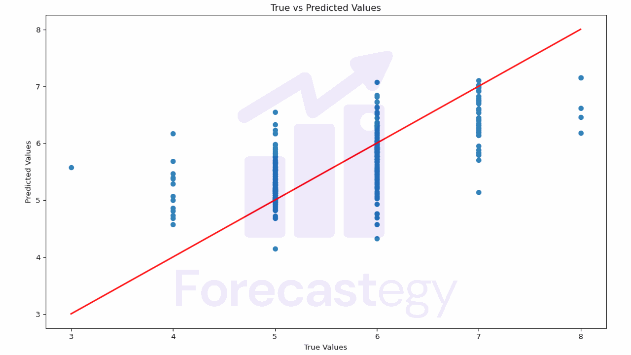
This plot helps you understand how close the predictions are to the actual values.
If the points are scattered far from the red line, it means the model’s predictions are not very accurate.
In our case it’s harder to evaluate, because our true values are discrete (3, 4, 5, 6, 7, 8) and our predictions are continuous.
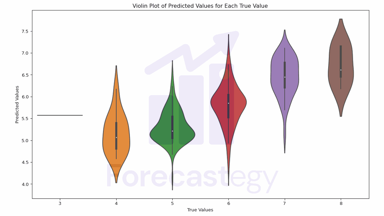
We can use Seaborn’s violin plot function to create a violin plot for the true and predicted values.
The violin plot combines a box plot with a kernel density plot, which can give us more information about the distribution of the values.
import seaborn as sns

plt.figure(figsize=(10, 5))
sns.violinplot(x=y_test, y=predictions)
plt.xlabel('True Values')
plt.ylabel('Predicted Values')
plt.title('Violin Plot of Predicted Values for Each True Value')
plt.show()

In this plot, the width of the violin represents the density of the data.
The white dot is the median, and the box represents the interquartile range (IQR). The whiskers are 1.5 times the IQR.
Ideally the mass of each violin should be centered on the true value.
We see that, for quality 4 wines, the model tends to overestimate the quality.
It’s better at 5 and 6, and it tends to underestimate the quality for 7 and 8.
Another useful plot is the distribution of the residuals (the difference between the true and the predicted values).
A good model would have residuals that are normally distributed around 0.
residuals = y_test - predictions

plt.figure(figsize=(10, 5))
plt.hist(residuals, bins=20)
plt.xlabel('Residual')
plt.ylabel('Frequency')
plt.title('Distribution of Residuals')
plt.show()
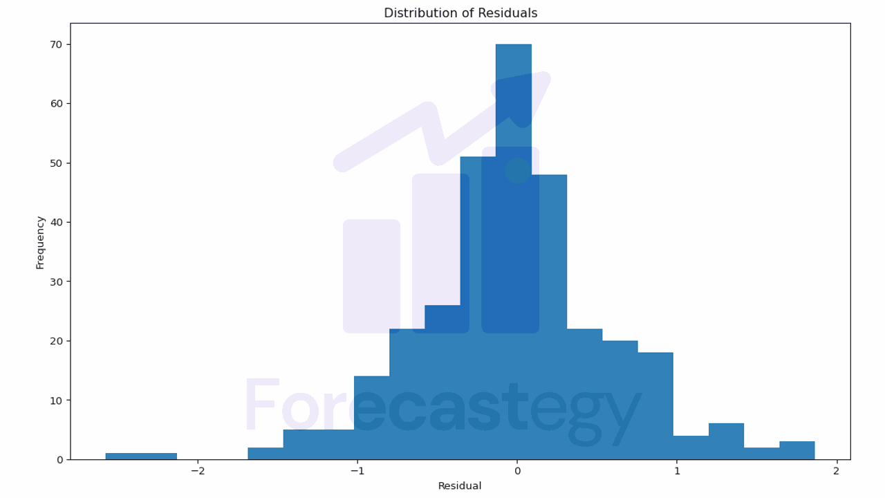
This plot helps you understand the errors your model is making.
If the residuals are not centered around 0 or have a skewed distribution, it may indicate that your model is systematically overestimating or underestimating the target variable.
In our case, the model seems to be doing a pretty good job.