In this post, you will learn how to easily forecast intermittent time series data using the StatsForecast library in Python.
Intermittent time series data is unique in the world of forecasting because it often includes missing data, irregular values, or a large number of zeros.
They usually start appearing when you go down in the hierarchy levels of a time series.
Traditional forecasting methods can struggle with these types of data, but after reading this post, you’ll have all the tools you need to tackle even the most complex intermittent time series.
I’ll walk through the process of setting up the library, preprocessing the data, training and evaluating models.
Let’s begin!
Models For Intermittent Time Series Forecasting
We can think about intermittent time series forecasting as a two-step process:
The first step is to determine if there will be a value different from zero today.
This is equivalent to asking the question “Will there be rain today?” or “Will we sell a product today?”
The second step is to determine how much of the value there will be.
There is no point in forecasting a value when we predict it will be zero.
This is equivalent to asking the question “If it rains, how much will it rain?” or “If we sell a product today, how many will we sell?”
Most of the models for intermittent time series forecasting will follow this two-step process.
Some of them will vary how they calculate each step (Croston, for example, uses the interval between demand occurrences to calculate the probability of demand), but they follow the same general idea.
Croston Classic Model
This is probably the most well-known model for intermittent time series forecasting.
It forecasts two quantities:
- The values for periods with non-zero values
- The interval between non-zero values
These are the steps in this specific StatsForecast implementation in a [sales forecasting example(../sales-forecasting-multiple-products-python/)]:
The first step is to use the Simple Exponential Smoothing (SES) method to predict the values for the days when there is demand.
The SES is fit to a series of values that excludes the zeros, then it forecasts the next value in the series (the value we should see the next day with sales).
The second step is to use a different SES model to predict the intervals between days with sales.
This step is important because it helps us to predict the number of days until the next sale occurs.
We forecast one-step ahead, so we will get the number of days until the next sale occurs.
The final step is to divide the first forecast (sales value) by the second forecast (number of days until the next sale).
This gives us an estimate of the demand for each day.
If the second forecast is zero, we use the first forecast as our final prediction.
This is because, if the second forecast is zero, it means that there will be demand every day and our final prediction will be the same as the first forecast.
Aggregate-Disagregate Intermittent Demand Approach (ADIDA)
This method first aggregates the data into larger time intervals (eg: weekly to monthly or quarterly) and then uses a traditional time series forecasting method to forecast the aggregated data.
The forecast is then disaggregated into the original time interval.
The specific implementation in StatsForecast is as follows:
The first step in the ADIDA approach is to aggregate the data into a larger time interval, such as weekly to monthly or quarterly.
This step helps to reduce the number of zeros in the data and make it easier to forecast.
For example, if we have daily sales data for a store, we can aggregate the data into weekly or monthly sales data.
The second step is to use a traditional time series forecasting method to forecast the aggregated data.
Here we use Simple Exponential Smoothing (SES) again to forecast the next value in the series.
The final step is very simple: we divide the forecasted value by the number of days in the time interval.
For example, if we aggregated the data from daily to weekly, we would divide the forecasted value by 7 to get the value for each day.
A fancier way to say it is to say we disaggregate the forecasted value using an uniform distribution.
Intermittent Multiple Aggregation Prediction Algorithm (IMAPA)
This method is similar to the above but it uses multiple aggregation levels in hopes of making the forecasting process more accurate.
The first step in the IMAPA approach is to aggregate the data into multiple levels.
For example, if we have daily sales data, we aggregate the data into weekly, monthly and quarterly.
Then we use Simple Exponential Smoothing (SES) to forecast the next value in the series for each aggregation level.
After we get the forecasted values for each aggregation level, we disaggregate using an uniform distribution (divide by the number of periods in each aggregation interval).
In our example, for the weekly aggregation level, we would divide the forecasted value by 7, for the monthly, by 30, and for the quarterly, by 90.
The final step is to combine the disaggregated forecasts using a simple average.
So our final forecast for each day is the average of the disaggregated forecasts for each level.
Teunter-Syntetos-Babai (TSB) Model
Finally, this method is inspired by the Croston method but instead of using the interval between value occurrences, it uses the probability of a value occurring.
The first step in the TSB Model is to use the Simple Exponential Smoothing (SES) method to predict the values of non-zero days, like in Croston.
The SES is fit to a series of values that exclude the zeros, then it forecasts the next step.
The second step is to use a different SES model applied to a binary series where 1 means there was a non-zero value and 0 means there was not.
This step helps us predict the probability that there will be demand on any given day.
Again, we forecast one-step ahead, so we will get the probability of demand on the next day.
To get the final forecast, we multiply the first forecast (value) by the second forecast (probability of non-zero value).
A cool advantage of this specific method in StatsForecast is that it allows you to tune the parameters of the internal SES models, as we will see in the next section.
Installing StatsForecast
StatsForecast is available on PyPI, so you can install it with pip:
pip install statsforecast
Or with conda:
conda install -c conda-forge statsforecast
Preparing The Data For StatsForecast
Let’s use weekly sales data from 800 products to learn how to use StatsForecast.
I transformed the data to make it easier to work with. At the end of this post, you can find the code I used to do it.
The data is in a CSV file with the following columns:
Product_Code: The product codeWeek: The week timestampSales: The number of sales for the product in the week
I selected 30 products that have at least 50% of their data as zeros. In other words, at least 26 weeks out of 52 have zero sales.
Let’s load the data and take a look at the first 5 rows:
import pandas as pd
import numpy as np
from matplotlib import pyplot as plt

data = pd.read_csv('train.csv', parse_dates=['Week'])

data = data.rename(columns={'Week': 'ds', 'Sales': 'y', 'Product_Code': 'unique_id'})
| unique_id | ds | y |
|---|---|---|
| P224 | 2020-12-20 00:00:00 | 0 |
| P257 | 2020-12-20 00:00:00 | 0 |
| P282 | 2020-12-20 00:00:00 | 0 |
| P283 | 2020-12-20 00:00:00 | 0 |
| P340 | 2020-12-20 00:00:00 | 0 |
StatsForecast requires the data to be stacked like you see above with the following columns:
unique_id: The unique identifier for each time series. In our case, each series is a product.ds: The timestamp for each observation.y: The value for each observation. In our case, the number of sales.
Let’s split the data into train and test sets:
train = data.loc[data['ds'] < '2021-10-20']
valid = data.loc[(data['ds'] >= '2021-10-20')]
h = valid['ds'].nunique()
We will use a simple time series split between past and future. Never split your data randomly when working with time series data!
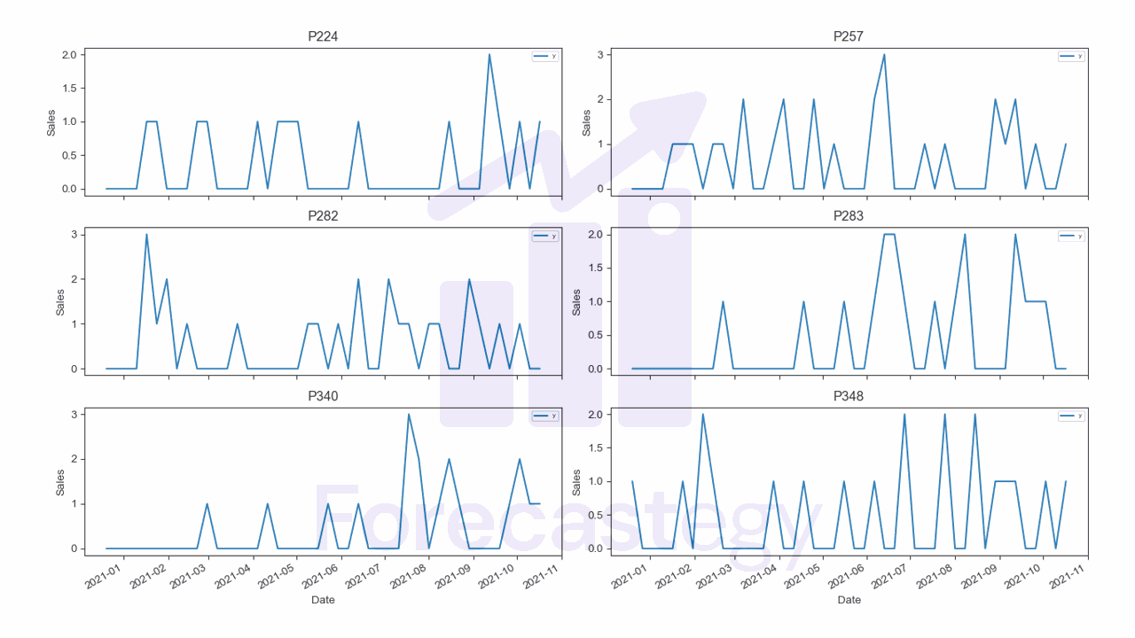
This is what the training data for a few products looks like:
fig,ax = plt.subplots(3,2, figsize=(1280/96, 720/96))
ax = ax.flatten()

p_ = train.set_index('ds')
for ax_, product in zip(ax, p_['unique_id'].unique()[:6]):
    product_y = p_.loc[p_['unique_id'] == product, 'y']
    ax_.set_title(f"{product}")
    ax_.plot(product_y, label='y')
    ax_.legend(loc='upper right', fontsize='xx-small')
    ax_.set_xlabel('Date')
    ax_.set_ylabel('Sales')

fig.autofmt_xdate()
fig.tight_layout()

You can see a lot of zeros… we are about to have some fun!
Python Code To Build The Forecasting Models
A great advantage of StatsForecast is that it allows you to build multiple models and compare them very easily.
from statsforecast import StatsForecast
from statsforecast.models import ADIDA, CrostonClassic, IMAPA, TSB

model = StatsForecast(models=[ ADIDA(),
                                CrostonClassic(),
                                IMAPA(),
                                TSB(alpha_d=0.2, alpha_p=0.2)], freq='W', n_jobs=-1)
model.fit(train)
We need two objects from StatsForecast:
StatsForecast is the class that will manage building the models and making the forecasts.
From the models module, we import the models we discussed above: ADIDA, CrostonClassic, IMAPA, and TSB.
We also need to specify the frequency of the data, which is W for weekly data, and the number of jobs to run in parallel.
Like in scikit-learn, we can set n_jobs=-1 to use all available cores.
TSB requires two parameters: alpha_d and alpha_p. These are the smoothing parameters for the internal SES for values and probabilities, respectively.
I followed the official documentation and set them to 0.2.
Then we call the fit method with the training data to build the models.
To make the forecasts, we call the predict method with the number of steps to forecast (horizon), h:
p = model.predict(h=8)
p = p.reset_index().merge(valid, on=['ds', 'unique_id'], how='left')
I merged the predictions with the validation data to make it easier to evaluate the models.
This is what the predictions look like:
| unique_id | ds | ADIDA | CrostonClassic | IMAPA | TSB | y |
|---|---|---|---|---|---|---|
| P224 | 2021-10-24 00:00:00 | 0.369706 | 0.303274 | 0.418088 | 0.561008 | 1 |
| P224 | 2021-10-31 00:00:00 | 0.369706 | 0.303274 | 0.418088 | 0.561008 | 1 |
| P224 | 2021-11-07 00:00:00 | 0.369706 | 0.303274 | 0.418088 | 0.561008 | 2 |
| P224 | 2021-11-14 00:00:00 | 0.369706 | 0.303274 | 0.418088 | 0.561008 | 2 |
| P224 | 2021-11-21 00:00:00 | 0.369706 | 0.303274 | 0.418088 | 0.561008 | 0 |
We have a column for each model and the actual sales.
Just like in the input data, the predictions are stacked.
Let’s see what they look like for a few products:
fig,ax = plt.subplots(3,2, figsize=(1280/96, 720/96))
ax = ax.flatten()

p_ = p.set_index('ds')
for ax_, product in zip(ax, p['unique_id'].unique()[:6]):
    product_y = p_.loc[p_['unique_id'] == product, 'y']
    ax_.set_title(f"{product}")
    ax_.plot(product_y, label='y')

    for model_ in ['ADIDA', 'CrostonClassic', 'IMAPA', 'TSB']:
        product_p = p_.loc[p_['unique_id'] == product, model_]
        ax_.plot(product_p, label=model_)
        ax_.set_xlabel('Week')
        ax_.set_ylabel('Sales')
    ax_.legend(loc='upper right', fontsize='xx-small')

fig.autofmt_xdate()
fig.tight_layout()
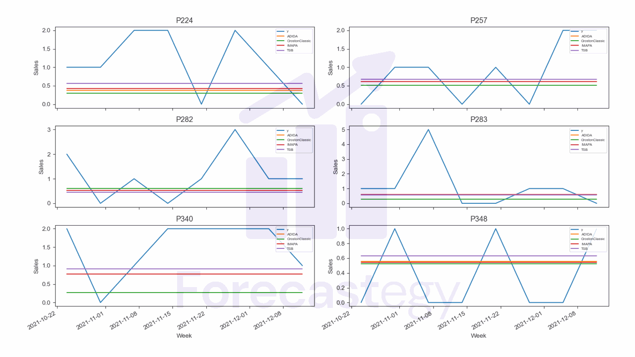
As you see, the forecasts are a constant extended through time.
This is expected since we are always predicting one step ahead.
Evaluating Models For Intermittent Time Series Forecasting
There are two main approaches I like to use to evaluate intermittent time series forecasting models: Cumulative Forecast Error and Mean Squared Error.
If you want more details, I found this article that goes into depth about many different evaluation metrics.
Cumulative Forecast Error (CFE)
Cumulative Forecast Error (CFE) is one of the key metrics used to evaluate the performance of models for intermittent time series forecasting.
In our example, we simply take the difference between our forecasted sales and the actual sales that took place.
If our model forecasts that we will sell 3 units in a given week, and we actually sell 2 units, then our error for that week is 1 unit.
Notice we don’t use the absolute value of the error, so we can tell if the model is over or underestimating the sales.
We repeat this process for every week, sum the total error for all weeks and this is what we refer to as the cumulative forecast error.
Because of the many zeros, using the error over many periods allows us to focus more on the general trend than specific weeks.
In practice, it doesn’t usually matter if we will sell the product this week or next week, as long as we know how many units we will sell in the next few weeks.
def cfe(y_true, y_pred):
    cfe_t = np.cumsum(y_true - y_pred)
    cfe_min= np.min(cfe_t)
    cfe_max = np.max(cfe_t)
    return cfe_t.iloc[-1], cfe_min, cfe_max

cfe_table = pd.DataFrame(columns=['unique_id', 'ADIDA', 'CrostonClassic', 'IMAPA', 'TSB'])
cfe_table['unique_id'] = p['unique_id'].unique()
for model_ in ['ADIDA', 'CrostonClassic', 'IMAPA', 'TSB']:
    cfe_table[model_] = cfe_table['unique_id'].apply(lambda x: cfe(p.loc[p['unique_id'] == x, 'y'], p.loc[p['unique_id'] == x, model_])[0])
cfe_table = cfe_table.set_index('unique_id')
cfe_table['best'] = cfe_table.abs().idxmin(axis=1)
print(cfe_table.head(5).to_markdown())
This function calculates the minimum and maximum cumulative forecast error as suggested in the article I linked above.
In the table I just show the last value, which is the cumulative forecast error for the entire validation period.
| unique_id | ADIDA | CrostonClassic | IMAPA | TSB | best |
|---|---|---|---|---|---|
| P224 | 6.04235 | 6.57381 | 5.65529 | 4.51194 | TSB |
| P257 | 2.08822 | 2.93722 | 2.06807 | 1.55328 | TSB |
| P282 | 4.75283 | 4.20181 | 4.75813 | 5.3185 | CrostonClassic |
| P283 | 4.14085 | 6.62252 | 4.29539 | 4.5558 | ADIDA |
| P340 | 5.86829 | 9.85434 | 5.79847 | 4.67352 | TSB |
See that, although there are patterns, each product can have a different best model.
This is where you can use your domain knowledge to decide if this is happening by chance and it makes sense to use the same model for all products or you should use a different model for each product.
An option I like is trying to cluster products based on their time series characteristics or categories and then decided on the model for each cluster.
Root Mean Squared Error (RMSE)
An alternative that is suggested to be stable in the article is the Mean Squared Error (MSE).
Here I will use the Root Mean Squared Error (RMSE) since it is easier to interpret.
mse_table = pd.DataFrame(columns=['unique_id', 'ADIDA', 'CrostonClassic', 'IMAPA', 'TSB'])
mse_table['unique_id'] = p['unique_id'].unique()
for model_ in ['ADIDA', 'CrostonClassic', 'IMAPA', 'TSB']:
    mse_table[model_] = mse_table['unique_id'].apply(lambda x: np.sqrt(np.mean((p.loc[p['unique_id'] == x, 'y'] - p.loc[p['unique_id'] == x, model_])**2)))
mse_table = mse_table.set_index('unique_id')
mse_table['best'] = mse_table.idxmin(axis=1)
print(mse_table.head(5).to_markdown())
| unique_id | ADIDA | CrostonClassic | IMAPA | TSB | best |
|---|---|---|---|---|---|
| P224 | 1.08621 | 1.13341 | 1.05314 | 0.963048 | TSB |
| P257 | 0.82311 | 0.862656 | 0.822315 | 0.804409 | TSB |
| P282 | 1.10106 | 1.06548 | 1.10142 | 1.14077 | CrostonClassic |
| P283 | 1.62089 | 1.74489 | 1.62716 | 1.63819 | ADIDA |
| P340 | 1.01886 | 1.42032 | 1.01259 | 0.917212 | TSB |
Finding the Best TSB Parameters
The TSB model seems to be doing really well in our data.
If this is the case for your data, or you want to try multiple values of alphas, let’s see how to do it.
A note: the current pip version of TSB does not seem to have the alias parameter, so I had to uninstall it and install the package from the github repository.
pip install git+https://github.com/Nixtla/statsforecast
This parameter is important for us to name the columns in the output dataframe.
from statsforecast import StatsForecast
from statsforecast.models import TSB

alpha_d = np.linspace(0.1, 0.9, 5)
alpha_p = np.linspace(0.1, 0.9, 5)

model = StatsForecast(models=[TSB(alpha_d = alpha_d_, alpha_p = alpha_p_, alias=f"TSB_{alpha_d_:.1f}_{alpha_p_:.1f}")
                              for alpha_d_ in alpha_d for alpha_p_ in alpha_p],
                      freq='W', n_jobs=-1)
model.fit(train)
The difference from the previous example is that we are using a list comprehension to create a list of TSB models with different values of alphas.
We are also using the alias so that we know which model had which combination of alphas.
As we have only 5 values for each alpha, we will do a simple grid search.
After seeing the results with this small number of values, we can decide if we want to do a more exhaustive search.
p = model.predict(h=8)
p = p.reset_index().merge(valid, on=['ds', 'unique_id'], how='left')

def cfe(y_true, y_pred):
    cfe_t = np.cumsum(y_true - y_pred)
    cfe_min= np.min(cfe_t)
    cfe_max = np.max(cfe_t)
    return cfe_t.iloc[-1], cfe_min, cfe_max


model_names = [f"TSB_{alpha_d_:.1f}_{alpha_p_:.1f}" for alpha_d_ in alpha_d for alpha_p_ in alpha_p]
cfe_table = pd.DataFrame(columns=['unique_id'] + model_names)
cfe_table['unique_id'] = p['unique_id'].unique()
for model_ in model_names:
    cfe_table[model_] = cfe_table['unique_id'].apply(lambda x: cfe(p.loc[p['unique_id'] == x, 'y'], p.loc[p['unique_id'] == x, model_])[0])
cfe_table = cfe_table.set_index('unique_id')
cfe_table['best'] = cfe_table.abs().idxmin(axis=1)
print(cfe_table[cfe_table['best'].unique().tolist()[:3]+['best']].head(5).to_markdown())
These were the results for a few combinations:
| unique_id | TSB_0.3_0.9 | TSB_0.5_0.7 | TSB_0.1_0.1 | best |
|---|---|---|---|---|
| P224 | 0.978838 | 2.45173 | 5.60449 | TSB_0.3_0.9 |
| P257 | -2.39145 | 0.267374 | 2.01247 | TSB_0.5_0.7 |
| P282 | 8.91721 | 8.40898 | 3.67891 | TSB_0.1_0.1 |
| P283 | 8.90366 | 8.21674 | 4.57723 | TSB_0.1_0.1 |
| P340 | 1.94728 | 2.88633 | 6.40395 | TSB_0.1_0.9 |
We have 25 columns, so I am only showing the ones that were the best for a few products.
Again, use your domain knowledge to double check if the results make sense.
A good way to do this is checking if the neighborhood of the best parameters has a similar performance.
For example, if the best parameters are alpha_d = 0.3 and alpha_p = 0.9, we can check if the performance is similar for alpha_d = 0.3 and alpha_p = 0.8.
If the results change a lot, the parameters might be a fluke on an unstable performance region.
Data Preprocessing Code
This is the code I used to transform the original data into the format used in this post.
import pandas as pd
import numpy as np
from matplotlib import pyplot as plt

path = 'Sales_Transactions_Dataset_Weekly.csv'
data = pd.read_csv(path).drop(['MIN', 'MAX'], axis=1)
data = data.melt(id_vars=['Product_Code'], var_name='Week', value_name='Sales')
data = data.loc[~data['Week'].str.contains("Normalized")]
data['Week'] = data['Week'].str.replace('W', '').astype(int) * 60 * 60 * 24 * 7 + (2021 - 1970) * 60 * 60 * 24 * 365
data['Week'] = pd.to_datetime(data['Week'], unit='s') + pd.offsets.Week(weekday=6)
zeros = data.groupby('Product_Code')['Sales'].apply(lambda x: (x == 0).mean()).sort_values(ascending=True)
zero_products = zeros[zeros > 0.5].head(30).index
data = data.loc[data['Product_Code'].isin(zero_products)]
data.to_csv('train.csv', index=False)